Finding the perfect hue for your home starts with understanding your own color preferences and the mood you want to create. Choose a favorite color as your base, then add complementary shades while balancing warm and cool tones for an inviting atmosphere. Don't forget to incorporate an exciting accent color to keep things dynamic. Experiment with paint samples in different lighting to see how colors interact throughout the day. By limiting your palette to 3-5 colors, you can create a cohesive look that enhances your space. There's so much more to explore about crafting your ideal color palette.
Key Takeaways
- Start by identifying your favorite color to serve as a base for your home palette.
- Incorporate a mix of highlights and low-lights for added depth and interest.
- Balance warm and cool tones to create an inviting and harmonious atmosphere.
- Limit your color choices to 3-5 main colors to maintain coherence and reduce visual chaos.
- Experiment with paint samples in different lighting to see how colors interact in your space.
As an affiliate, we earn on qualifying purchases.
Understanding Color Analysis
Understanding color analysis can transform how you view both your wardrobe and home decor. By identifying your unique skin undertones, you can discover a personal color palette that highlights your best features and enhances your confidence.
Seasonal categories—like spring, summer, autumn, and winter—help you pinpoint the colors that work best for you, allowing for smarter choices in both fashion and decor.
When you integrate your personal color palette into your home decor, you create a cohesive aesthetic that reflects your style. This isn't just about looking good; it's about shaping the ambiance of your space. Colors that harmonize with your preferences can improve your mood and create a calming, inviting atmosphere.
Understanding color compatibility through color analysis also guides your shopping decisions, ensuring that your purchases align with your palette. This means you'll find satisfaction in both your wardrobe and home decor, as everything will complement each other beautifully.
The Impact of Color in Design
Color plays a pivotal role in design, shaping the mood and atmosphere of any space. When you choose your color palettes, consider how different hues influence emotions; cool colors promote calmness, while warm tones create energy and warmth. This means that selecting the right paint color can dramatically alter the feel of a room.
Integrating a personal color palette into your interior design enhances the energy of your space, reflecting your unique style and preferences.
Don't forget about accent colors; these can bring a dynamic touch to your decor and provide visual interest.
Light colors can improve the appearance in photographs, which boosts confidence and creates a more inviting atmosphere.
It's crucial to understand how color psychology can guide your palette selection for specific rooms. By choosing hues that evoke the desired emotional response, you can transform a space to suit your needs. Additionally, considering neutral tones can create a calming environment that enhances the modern farmhouse style.
Steps to Create Your Palette
Selecting the right colors is just the beginning; creating a cohesive palette brings your vision to life. Start by identifying one color you love, using it as a base for your palette that resonates with your personal style in both clothing and decor. From there, incorporate a range of highlights and low-lights to add depth and richness, utilizing contrasting shades for visual interest. Choosing the right color palette can also play a significant role in creating a mood or ambiance within a space. Soft, muted tones can evoke a sense of calm and tranquility, while bold, vibrant colors can bring energy and excitement. By carefully considering the emotions you want to inspire, you can further enhance the impact of your color choices. In the end, choosing the right color palette is about more than just aesthetics; it’s about telling a story and setting the tone for your personal style and the atmosphere of the space.
Next, aim to balance cool and warm tones in your selections. This creates an inviting atmosphere, especially when you integrate complementary materials like wood and brass into your furniture. Choose an accent color that contrasts with your primary hues. This adds excitement and personality to your home's overall design.
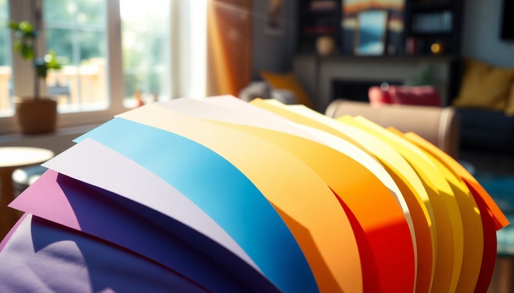
Finally, limit your palette to 3 to 5 main colors. This helps maintain coherence and guarantees each color enhances the overall aesthetic and emotional impact of your space.
Trends and Successful Case Studies
Homeowners today are embracing a variety of color trends that bring warmth and sophistication to their spaces. One standout hue is indigo, which serves as a calming base for many palettes for your home. This versatile color pairs seamlessly with large furniture, creating a balanced and inviting atmosphere.
Meanwhile, terracotta is making waves, reflecting a shift toward earthy tones that evoke a sense of nostalgia and comfort.
Timeless shades like navy and teal remain favorites, as they embody elegance and sophistication. For inspiration, look at Ian Brennan's stunning home, where a charcoal gray and aubergine palette showcases how deep, rich colors can create sophistication and depth.
Joy Cho's vibrant navy blue foundation, accented with gold and teal, illustrates the power of contrast, energizing the space while maintaining cohesion.
Incorporating certain colors can enhance your home's aesthetic, allowing you to express your personality through your perfect color palette. As you explore these trends and successful case studies, consider how these choices can influence the overall ambiance of your living space, guiding you toward a design that feels uniquely yours. Additionally, creating a harmonious environment can be complemented by smart bathroom technologies that enhance comfort and convenience throughout your home.
Practical Tips for Color Selection
Choosing the right colors for your space can feel overwhelming, but it doesn't have to be. Start by evaluating your personal preferences and lifestyle needs; this guarantees your color selection resonates with your daily life.
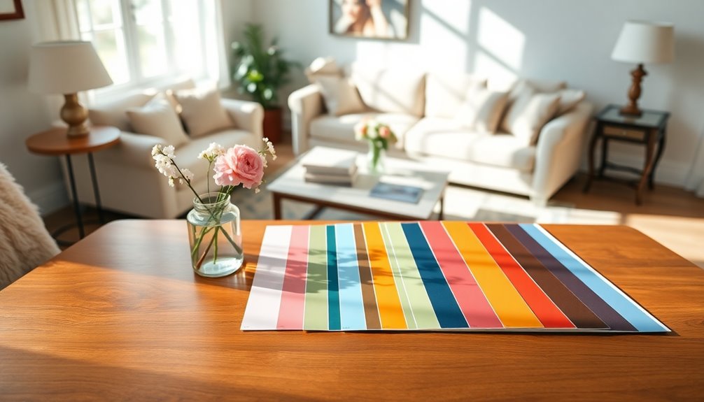
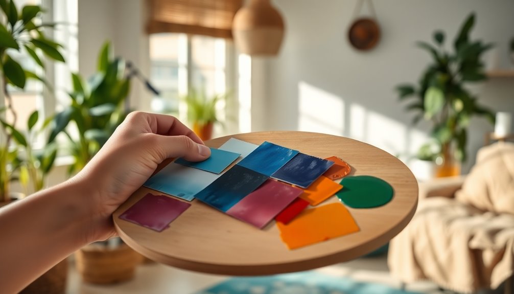
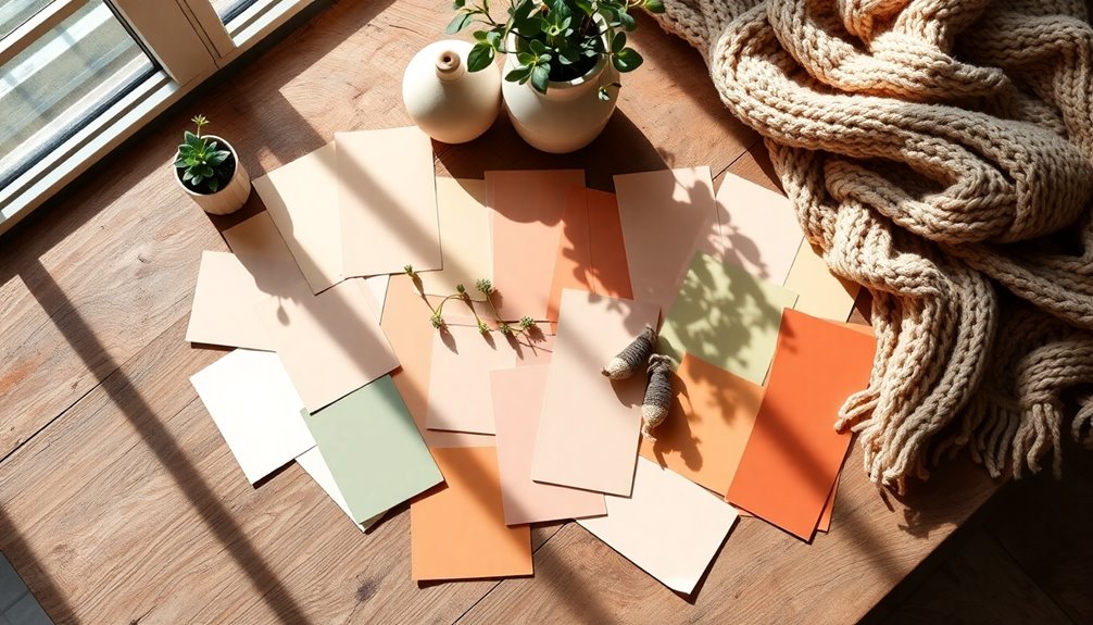
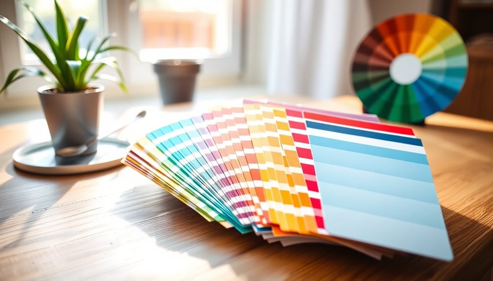
Experiment with paint samples in various lighting conditions. Natural light can greatly alter how colors appear, so see how they look at different times of day. You can also leverage online color theory resources and visualizers to create and compare vibrant color palettes that align with your vision.
To help maintain a harmonious atmosphere, consider the following:
| Tip | Explanation |
|---|---|
| Limit Your Palette | Stick to 3-5 main colors to reduce visual chaos. |
| Balance Warm and Cool Tones | Create an inviting feel throughout your home. |
| Test in Different Lighting | Observe how colors change with light variations. |
Frequently Asked Questions
How Do Lighting Conditions Affect Color Perception in My Home?
Lighting conditions greatly affect how you perceive colors in your home.
Natural light can make hues appear more vibrant, while artificial lighting can alter their tone and warmth.
For instance, a warm bulb might enhance reds and yellows, whereas cool bulbs could emphasize blues and greens.
To truly understand how colors look, observe them in different lights throughout the day.
This way, you'll guarantee your chosen colors fit perfectly with your home's ambiance.
Can I Mix Warm and Cool Colors Successfully?
Absolutely, you can mix warm and cool colors successfully!
Imagine a living room where you paint one wall a rich navy blue (cool) while the others are a warm beige. The contrast creates a dynamic space that feels balanced.
To pull it off, try incorporating accessories that tie the colors together, like throw pillows or artwork.
Just remember to keep the proportions in mind to maintain harmony and prevent clashing.
What Are Some Common Color Pairing Mistakes to Avoid?
When choosing colors, avoid pairing too many bold shades together; it can overwhelm the space.
Don't forget about the undertones—mixing warm and cool colors without considering their base can clash.
Also, steer clear of matching everything exactly; it can feel flat and uninspired.
Finally, neglecting the scale of patterns and colors can lead to a disjointed look.
Balance is key, so aim for harmony in your choices for a cohesive design.
How Often Should I Refresh My Home's Color Palette?
You should refresh your home's color palette every few years, especially if you notice it feeling outdated or dull.
Trends change, and your personal style might evolve too. Consider updating when you're feeling restless or after significant life events, like a move or a new family member.
Regularly evaluating your space keeps it vibrant and inviting. Trust your instincts—if it feels off, it's probably time for a change!
Are There Colors That Can Make a Room Feel Larger?
You wouldn't believe how colors can transform a room!
To make your space feel larger, opt for light hues like soft whites, pale blues, or gentle grays. These colors reflect light and create an airy atmosphere, tricking your eyes into thinking the walls are miles away.
Don't shy away from monochromatic schemes either; they can unify the space, enhancing that spacious vibe.
With the right shades, your room will feel like a vast, open oasis!