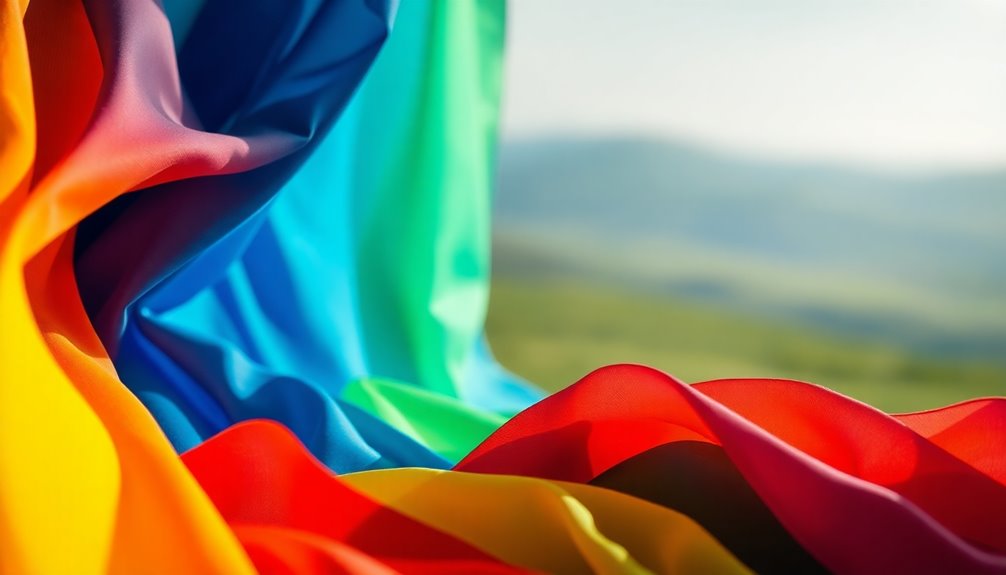
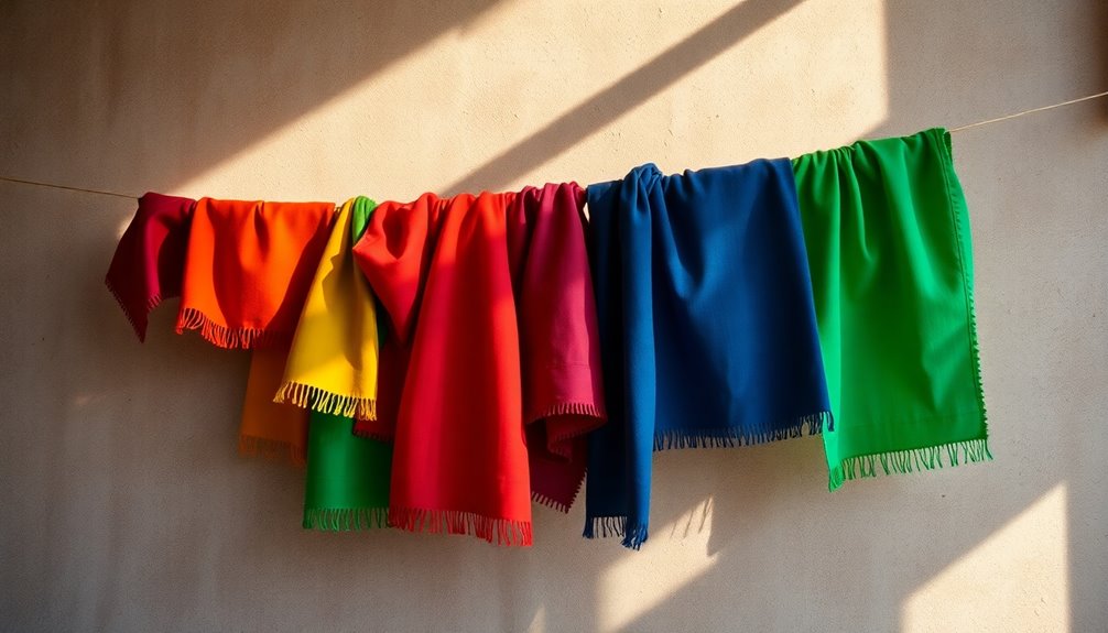
Understanding the psychology of color helps you choose a perfect palette that enhances mood and ambiance. Warm colors like red and yellow can energize a space, while cool tones like blue promote calmness. Remember, colors carry different meanings across cultures, so consider your audience. Whether you're branding or designing a room, use the 60-30-10 rule for a balanced look. Testing colors in natural light also matters, as it changes how shades appear. With the right choices, your space can reflect your intentions beautifully. There's much more to discover about color's impact and its practical applications.
Key Takeaways
- Understand color psychology: warm colors evoke excitement, while cool colors promote calmness, influencing the mood of your space.
- Consider cultural significance: colors carry different meanings across cultures, affecting perceptions and emotional responses.
- Apply the 60-30-10 rule: use a dominant color (60%), a secondary color (30%), and an accent color (10%) for visual balance.
- Test colors in various lighting: natural light affects color appearance, so evaluate paint samples under different lighting conditions.
- Incorporate natural elements: blending colors with biophilic design enhances well-being and creates a harmonious atmosphere.

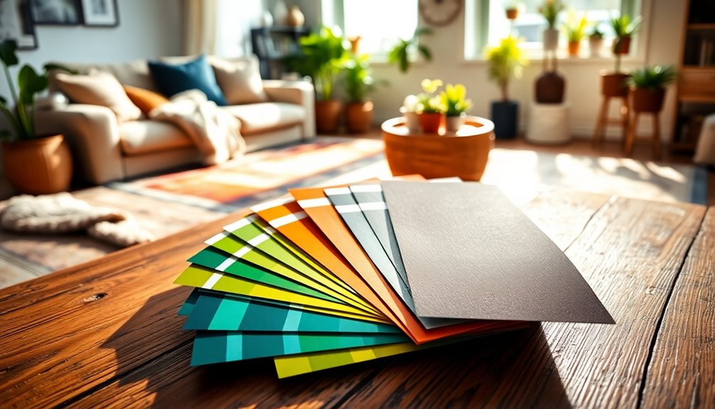
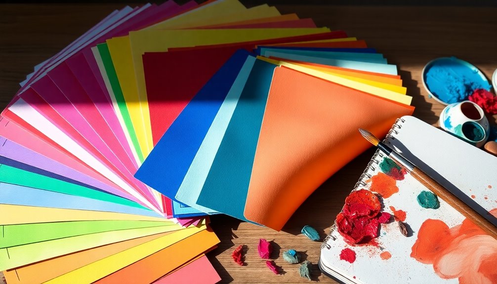
FoamPRO 120 Color Tester Sample Board – Paint Sample Boards for Comparing & Matching Colors – Portable Wall Paint Tester Sheets – 24-Pack
- Paint Color Sample Boards: Organize and compare paint colors easily
- Portable & Versatile: Easy to carry for on-the-go testing
- Efficient Painting Tools: Simplifies painting with clean, precise tools
As an affiliate, we earn on qualifying purchases.
As an affiliate, we earn on qualifying purchases.
Color Psychology Fundamentals
Understanding color psychology is vital for anyone looking to choose the perfect color palette. This field studies how colors impact emotions and behaviors. For instance, warm colors like red and yellow can spark excitement, while cool colors such as blue and green promote calmness and relaxation. Knowing this can help you create the desired atmosphere for your project.
Physiological responses also play a role; red can increase heart rates, while blue may lower stress levels. When you're choosing the right palette, consider the cultural context, as colors can carry different meanings across societies—white symbolizes purity in the West but mourning in the East.
It's important to align your color choices with your audience's demographics and preferences. Consistent use of color in branding can enhance recognition by up to 80%, as colors forge emotional connections that resonate with your brand's identity.
Effective color palette selection involves creating contrast and harmony, ensuring your visuals have the maximum impact. By understanding the fundamentals of color psychology, you'll be better equipped to select colors that not only look good but also communicate the right message.
Emotional Effects of Colors
Colors wield incredible power over our emotions, influencing how we feel and react in various environments. Understanding the psychology behind color can help you create spaces that evoke the desired emotional effects of colors.
For instance, red ignites heightened emotions like passion and urgency, making it perfect for stimulating action and conversation in social settings. In contrast, blue promotes calmness and tranquility, ideal for bedrooms or offices where relaxation and focus are key.
Yellow can evoke happiness and optimism, but be wary—too much yellow might lead to anxiety. Green symbolizes nature and health, fostering balance and harmony, making it suitable for living rooms and bathrooms. It's a color that naturally soothes the mind.
Finally, purple conveys luxury and creativity; lighter shades can promote calmness while darker shades add a dramatic flair, perfect for artistic or sophisticated environments.
Cultural Significance of Colors
When selecting colors for your project, it's crucial to reflect on their cultural significance.
A color that feels inviting in one culture might carry a completely different connotation in another.
Global Color Meanings
The significance of colors can vary dramatically from one culture to another, shaping perceptions and influencing emotions. Understanding global color meanings is essential in the psychology of color, especially when you're working on design or branding.
For instance, while white embodies purity in Western societies, it often signifies mourning in many Eastern cultures. This is just one example of how different colors can evoke contrasting feelings based on cultural context.
Red is another color with varied meanings; it symbolizes sacrifice and courage in many African cultures, but in some Asian cultures, it's linked to happiness and good fortune.
Similarly, blue represents tranquility and trust in the West, yet in certain Middle Eastern cultures, it offers protection against evil.
Green is widely seen as a representation of nature and fertility, but in Islamic cultures, it also embodies paradise.
Finally, yellow generally symbolizes joy in Western contexts, while in some parts of South America, it can signal caution.
Being aware of these global color meanings can help you choose colors that resonate positively with your intended audience.
Cultural Color Preferences
Cultural color preferences often vary widely, reflecting deep-rooted traditions and values within different societies. For instance, while you might associate white with purity and weddings in Western cultures, it can symbolize mourning in many Eastern cultures. This stark contrast highlights the psychological impact of colors, which can evoke different emotions and meanings depending on your cultural background.
In Africa, the color red represents both danger and sacrifice, while in certain Asian cultures, it's a symbol of good luck and prosperity. Similarly, green may evoke thoughts of fertility and nature in the West, but in some Middle Eastern cultures, it holds religious significance and denotes paradise.
Even blue, often seen as calming and trustworthy in the West, can evoke feelings of sadness and mourning in other cultures.
Understanding color psychology is essential, especially for brands looking to enter international markets. By researching local color associations, you can avoid miscommunication and guarantee your message resonates with the target audience.
Ultimately, recognizing cultural color preferences can make a significant difference in how your designs, marketing strategies, or products are perceived globally.
Color Choices in Branding

Selecting the right color palette can greatly impact your brand's success. Colors can boost brand recognition by up to 80%, so you need to choose wisely. The emotional responses elicited by different colors play an essential role in how your audience perceives your brand.
For example, warm colors like red and yellow are popular in fast-food branding because they stimulate appetite and excitement. In contrast, tech companies often lean towards cool colors like blue, which convey trust and professionalism.
When you create color combinations that resonate with your target audience, you enhance your brand identity and foster customer loyalty. Consistent use of your chosen palette across all marketing materials solidifies your visual language, making it easier for customers to recognize and connect with your brand.
It's also vital to take into account demographic preferences; younger consumers might gravitate towards vibrant hues, while older audiences may favor more muted tones. By understanding these dynamics, you can effectively tailor your branding strategy to elicit the desired emotional responses and build lasting connections with your audience.
Selecting Your Color Palette
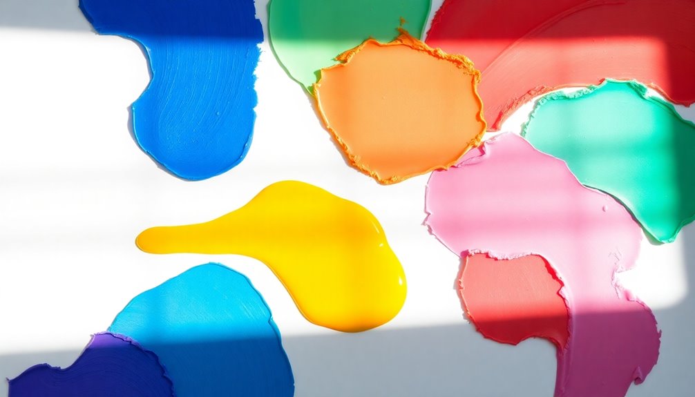
Choosing the right color palette is an essential step in bringing your vision to life, whether it’s for a brand or a personal space. When choosing the perfect colors for design, it’s important to consider the emotional impact that different colors can have on your audience or the atmosphere of a room. For example, bold, vibrant colors can energize a space, while softer, muted tones can create a more relaxing environment. Additionally, taking into account the psychology of color can help you evoke specific emotions or associations with your design.
Start with a neutral base color to create a cohesive foundation for your color palette. This allows you the flexibility to add accent colors later, which can really enhance visual interest.
To effectively select your color palette, consider these key strategies:
- Follow the 60-30-10 rule: Use 60% of your dominant color, 30% for a secondary color, and 10% for accent colors to achieve balance.
- Test colors: Sample paint on your walls under different lighting conditions, as colors can shift throughout the day.
- Complement existing decor: Confirm your chosen colors harmonize with your furniture and decor for a cohesive look.
- Draw inspiration: Look to nature, art, or personal experiences to develop a palette that resonates with your style and the mood you want to create.
Color Impacts on Room Design
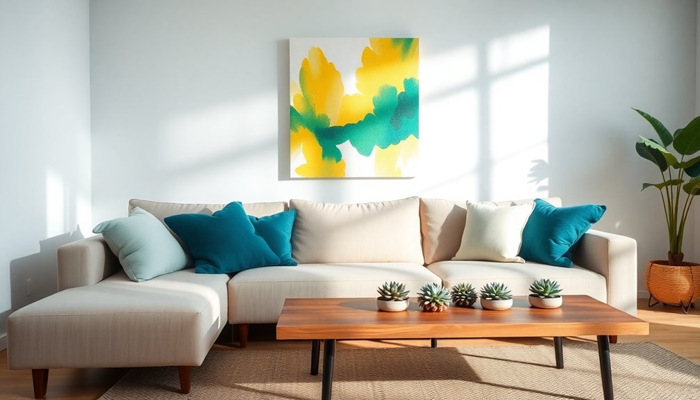
Color plays an essential role in shaping the atmosphere of a room, influencing how you feel and interact with the space. Your choice of color combinations can greatly affect the perceived mood. For example, warm colors like red and yellow energize social areas, making them perfect for living rooms or kitchens.
In contrast, cool colors such as blue and green create a calming vibe, ideal for bedrooms or bathrooms. If you're working with small rooms, lighter shades can create an illusion of spaciousness, while darker colors can offer a cozy feel in larger spaces.
To achieve a balanced look, consider the 60-30-10 rule for color distribution: 60% of a dominant color, 30% of a secondary color, and 10% of an accent color. This will give your design visual interest without overwhelming the senses.
Remember that natural light affects how colors appear throughout the day, so testing paint samples in different lighting is vital. Additionally, incorporating aesthetic hooks can enhance vertical space utilization while complementing your chosen color palette. Ultimately, your color choices not only define the aesthetics of your home but also impact its functionality—brighter colors can boost creativity in a home office, while softer tones can enhance relaxation in a bathroom.
Practical Color Application Tips

A solid color palette starts with a neutral base, which provides a versatile backdrop for your design. This foundation allows you to add accent colors that enhance your space without overwhelming it.
To create an effective color scheme, consider these practical tips:
- Follow the 60-30-10 rule: Allocate 60% of your space to a dominant color, 30% to a secondary color, and 10% to an accent color for balanced visual interest.
- Test colors in different lighting: Paint samples on your walls and observe how they shift throughout the day. This guarantees the hues align with the desired atmosphere.
- Consider the room's purpose: Use calming tones for bedrooms to promote relaxation, while vibrant colors can boost energy in workspaces.
- Gather feedback: Use A/B testing for color combinations to see which shades resonate best with your audience, confirming they support the intended mood.
- Incorporating natural elements into your color scheme can create a more harmonious environment that resonates with the psychology of color.
Frequently Asked Questions
How Do Personal Experiences Influence Color Perception?
Personal experiences shape how you perceive color in various ways. For instance, a favorite childhood memory might link a specific hue to feelings of joy, while a negative event could taint your view of another color.
Your cultural background and the environments you've lived in also play a role, influencing your emotional responses.
Ultimately, your unique journey creates a personal color palette, affecting your preferences and reactions to different shades throughout your life.
Can Color Preferences Change Over Time?
Imagine walking through a vibrant art gallery, each piece reflecting a different phase of your life.
You'll find that color preferences can indeed change over time. As you grow and experience new things, your feelings and associations with certain colors evolve.
What once brought you joy might fade, while new shades resonate deeply. It's a fluid journey, much like the seasons, constantly shifting to reflect who you're at that moment.
What Colors Are Best for Attracting Attention?
When you're looking to attract attention, bright and bold colors are your best bet. Colors like red, yellow, and orange naturally draw the eye and create energy.
You can also use contrasting colors to make important elements stand out. Think about your audience and the emotions you want to evoke—warm colors can evoke excitement, while cool colors might create calmness.
Choosing the right shades can make all the difference in grabbing attention effectively.
How Do Color Trends Evolve in Design?
Color trends in design shift like the tide, ebbing and flowing with societal moods and technological advances.
You'll notice how fresh palettes emerge, often influenced by cultural moments or environmental changes. Designers tap into these currents, weaving together hues that resonate with the time.
As you embrace new trends, remember that each color tells a story, reflecting not just aesthetics, but also the collective spirit and aspirations of a generation.
Are There Universal Color Meanings Across Cultures?
Yes, there are some universal color meanings, but they can vary by culture.
For instance, red often symbolizes passion or love in many places, while white typically represents purity or peace.
However, in some cultures, white can signify mourning.
You should consider these differences when designing or communicating visually.
Understanding these nuances helps you connect better with diverse audiences and guarantees your message resonates as intended.
Always be mindful of cultural context!