
To create a whole-home color flow without matching everything, choose a neutral base that sets a calm tone across spaces. Incorporate harmonious progressions by selecting related hues on the color wheel, varying saturation, and using subtle contrast. Add accents and textures strategically to bring depth without disrupting flow. Balance bold and subtle shades carefully, and layer textures for visual interest. If you keep exploring, you’ll discover how to make your home feel cohesive yet dynamic.
Key Takeaways
- Use cohesive color relationships, like analogous or complementary schemes, to create harmony without matching every room exactly.
- Incorporate bridging colors, accents, and subtle variations in hue, tone, and saturation for smooth transitions between spaces.
- Establish neutral bases in each area to provide consistency, then add personality with contrasting or bold accent colors.
- Vary textures and finishes across rooms to create tactile interest while maintaining overall color flow.
- Plan transitions thoughtfully to ensure visual connection and prevent abrupt or jarring color changes throughout the home.

Annie Sloan Wall Paint (Old White, 4 Fl Oz Tester)
- Color: Timeless off-white, versatile neutral
- Coverage: Up to 387 sq. ft. per gallon
- Application: Use brush or roller, prepare surface
As an affiliate, we earn on qualifying purchases.
As an affiliate, we earn on qualifying purchases.
Why Whole-Home Color Flow Matters for Style
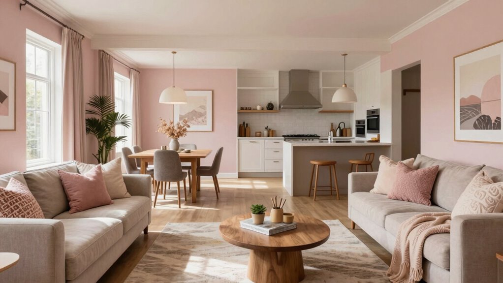
Having a cohesive color flow throughout your entire home is essential for creating a polished and harmonious style. When your colors work together seamlessly, your space feels more inviting and thoughtfully designed. Color psychology plays a key role here, as certain hues can influence mood and perception, making your home feel calm, energized, or cozy. Choosing paint with good durability ensures your color choices stay vibrant and intact over time, maintaining your cohesive look. A consistent color flow ties rooms together, guiding the eye naturally from one space to the next and avoiding jarring shifts. This approach enhances your home’s overall aesthetic, making it feel well put-together without the need for matching everything exactly. It’s about creating a unified atmosphere that reflects your style effortlessly. Additionally, understanding color flow fundamentals can help you make informed decisions that support your design goals. Recognizing the importance of color transitions can further refine your ability to create a seamless and appealing home environment. Paying attention to subtle shade variations can also help in achieving a smooth and natural progression of colors throughout your home. Incorporating smart lighting can also enhance your color flow by allowing you to adjust hues dynamically and create different moods with ease.
How Color Relationships (Hue, Tone, Contrast) Affect Your Home
Understanding how color relationships—such as hue, tone, and contrast—impact your home helps you create a balanced and dynamic space. These relationships influence mood and perception through color psychology and cultural color meanings. For example, warm tones evoke energy, while cool tones promote calmness. Contrast adds visual interest and guides the eye, making rooms feel lively or serene. By adjusting hue, tone, and contrast intentionally, you control the flow and harmony across your home. Additionally, analyzing interior design basics can help you understand how to integrate these color relationships effectively. Use complementary colors to create vibrant contrast and excitement. Incorporate analogous hues for smooth progressions and cohesion. Vary tones to add depth and dimension without overwhelming the senses. Mastering these relationships helps your space feel intentional, engaging, and cohesive—without matching everything exactly.
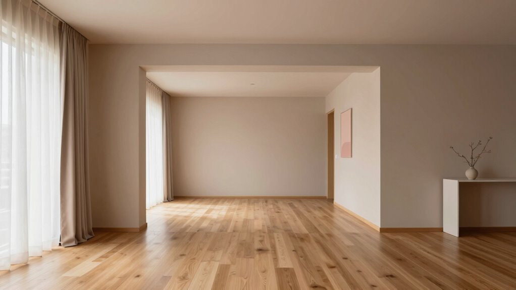
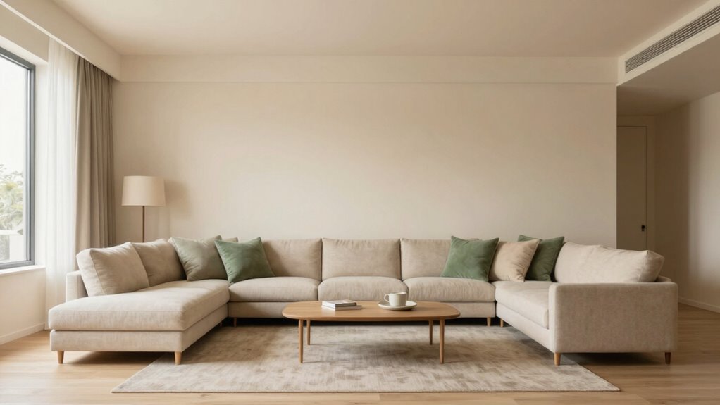
Picking a Neutral Base to Anchor Your Color Scheme
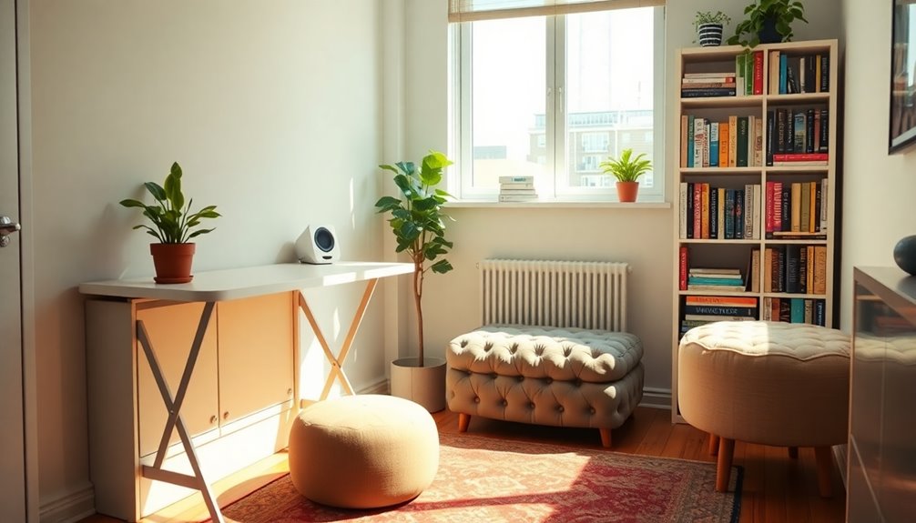
Choosing a neutral base is a crucial step in creating a cohesive and versatile color scheme for your home. Your neutral color palette sets the tone and influences the mood of each space through paint color psychology. Light neutrals, like soft beiges or warm greys, create a calm and inviting atmosphere, while cooler tones can add a modern, sleek feel. When selecting your base, consider how these colors interact with your overall design and the other hues you plan to use. A well-chosen neutral provides balance and flexibility, making it easier to introduce accent colors and patterns later. Additionally, selecting the right UST projector rankings can enhance your space by ensuring optimal brightness and color accuracy, creating a more immersive environment. Remember, neutral shades don’t mean boring—they serve as a sophisticated foundation that anchors your entire home’s color flow. Incorporating neutral paint colors that complement your furnishings can further unify your design. To achieve a seamless whole-home color flow, it’s helpful to understand how different neutrals interact and transition naturally from room to room. Exploring neutral color psychology can guide you in selecting shades that evoke the desired mood and ambiance throughout your home. Understanding the contrast ratio in your environment can also help in choosing neutrals that highlight or subdue certain features to create visual harmony.
Creating Seamless Transitions Between Rooms
How can you create smooth, effortless shifts between rooms to enhance your home’s overall flow? Using paint color psychology and color wheel fundamentals, you can design transitions that feel natural. Start by selecting hues close on the color wheel to ensure harmony across spaces, reducing visual jarring. Consider the emotional impact of colors; for example, calming blues can connect bedrooms and living areas. To maintain consistency, vary saturation and brightness subtly as you move from room to room. Incorporating color harmony principles can further refine your transitions and create a balanced look throughout your home. Additionally, understanding sound healing science can help you incorporate calming auditory elements that complement your visual flow. These techniques help your home’s palette flow seamlessly, creating a cohesive, inviting atmosphere without matching every wall exactly.
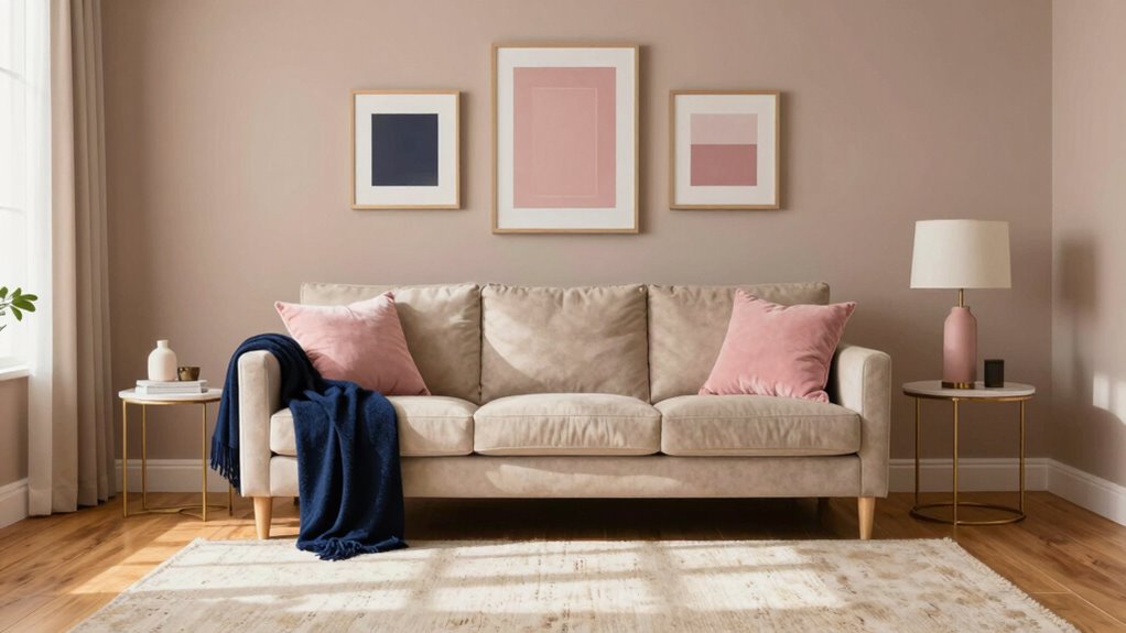
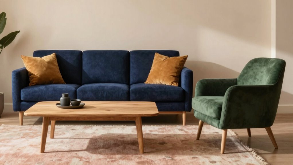
Adding Accent Colors to Bring Depth and Personality
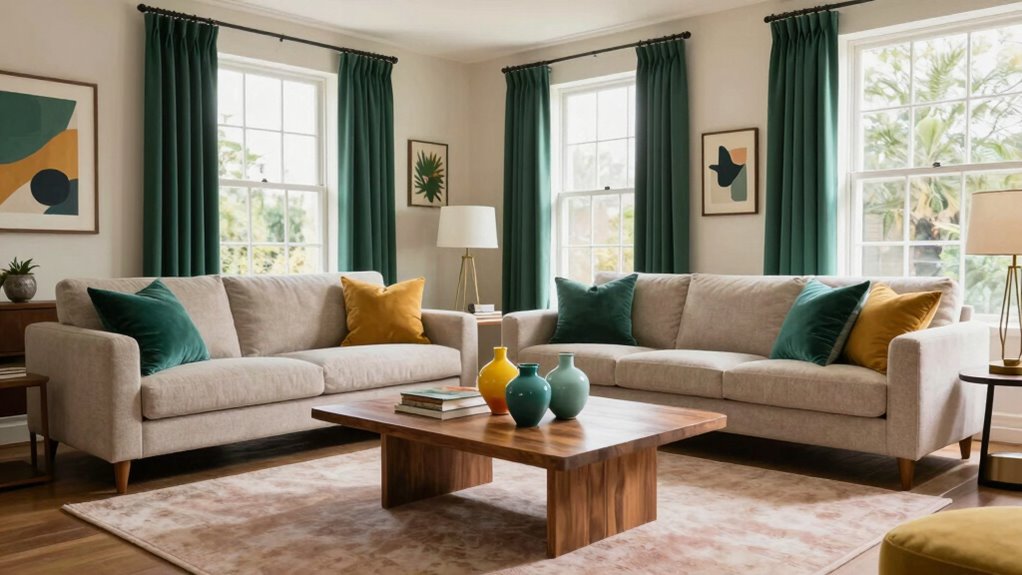
Adding accent colors is a great way to create depth and showcase your personality. Choose complementary hues to keep the flow harmonious, while bold accents add visual interest. Incorporating textured finishes further enhances the space, making it feel layered and inviting. Understanding color harmony principles can help you select the right hues for a balanced look.
Select Complementary Hues
Selecting the right complementary hues can instantly elevate your home’s color flow by creating visual interest and balance. Using the color wheel helps you identify hue harmony, where colors work well together without clashing. Choose hues opposite each other on the wheel for striking contrast or adjacent ones for subtle sophistication. These complementary shades add depth and personality to your spaces, making them feel cohesive yet dynamic. Keep in mind that small accents can make a big impact.
- Focus on color wheel relationships to find harmonious pairs
- Use contrast to highlight features or create focal points
- Balance bold hues with neutral tones for a refined look
Use Bold Accents
Incorporating bold accent colors instantly adds depth and personality to your home’s color flow. Bold accents serve as eye-catching details that highlight your style and create visual interest. Use these accents strategically to enhance overall color relationships, ensuring they complement or contrast harmoniously with your main hues. You might add a vibrant throw pillow, a striking piece of artwork, or a bold-colored lamp to anchor your spaces. These accents shouldn’t overpower but instead elevate your palette, making your home feel dynamic and cohesive. Remember, the key is balance—bold accents bring personality without disrupting the flow. By thoughtfully choosing and placing these color pops, you craft a layered, inviting environment that reflects your unique taste.
Incorporate Textured Finishes
Textured finishes are a powerful way to infuse depth and personality into your home’s color flow. They add tactile surfaces that invite touch and visual interest, making your space feel more dynamic. Incorporating textured finishes can be as simple as adding a plaster wall, using textured wallpaper, or choosing textured fabrics for furniture and accessories. These elements create subtle contrasts and enrich the overall design without overwhelming the eye. To achieve this, consider:
- Applying textured paint or plaster to accent walls
- Using tactile fabrics like boucle or woven textiles
- Incorporating textured tiles or stone in key areas
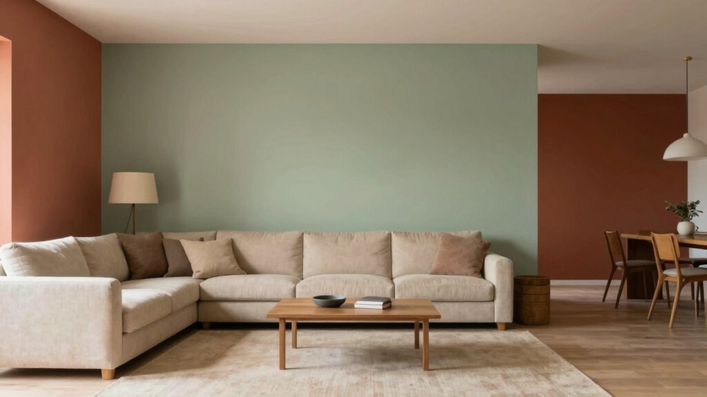
Balancing Bold and Subtle Colors Without Matching Everything

To create a balanced look, you need to vary color intensity across different spaces, mixing bold shades with subtle hues. Incorporating different textures and finishes helps prevent everything from feeling too matchy, adding visual interest. Using a mix of accent colors and neutral tones allows you to highlight key areas without overwhelming the overall flow. Additionally, understanding boho color palettes can guide you in selecting harmonious yet diverse shades that enhance your home’s natural and eclectic vibe. Exploring color harmony principles can further help you achieve a cohesive yet dynamic home design. Considering nail styles names can also inspire your choices by integrating various shapes and finishes to create a more personalized and lively aesthetic. When selecting colors, considering electric bike speed and power capabilities can subtly influence your aesthetic choices, especially in modern, technology-inspired spaces. Paying attention to piercing materials and jewelry can also add a layer of personal expression to your decor, reflecting your style preferences subtly throughout your home.
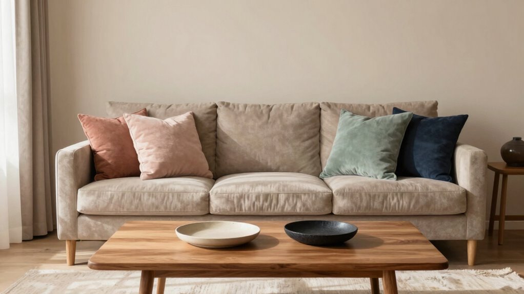
Varying Color Intensity
Balancing bold and subtle colors in your home can create a dynamic and inviting space without feeling overwhelming. Varying color intensity helps attain this balance, adding depth and interest. You can use monochromatic schemes to play with different shades of the same color, creating subtle shifts that keep things cohesive. Incorporate color blocking by combining bold, saturated hues with softer, muted tones to add contrast without clashing. Color temperature can also influence how colors interact and evoke different moods within your space.
- Use bold colors in accent walls or accessories, and softer hues in larger areas.
- Mix high-contrast shades with low-saturation tones for visual variety.
- Vary the intensity of your colors while maintaining harmony through thoughtful placement.
This approach ensures your home feels lively yet balanced, avoiding monotony or chaos.
Mixing Textures and Finishes
Building on your understanding of color variation, mixing textures and finishes allows you to create visual interest and depth without relying solely on color. Incorporating textured finishes and mixed materials adds dimension and contrast. For example, pairing smooth painted walls with rougher stone or wood accents creates a tactile balance that feels intentional. Using different finishes—matte, satin, gloss—can also enhance the layered look without matching everything. Consider this table for inspiration:
| Texture/Finish | Material Examples | Effect |
|---|---|---|
| Textured finishes | Stucco, textured wallpaper | Adds depth and tactile interest |
| Smooth surfaces | Painted walls, glass | Provides visual calm |
| Matte | Fabrics, walls | Soft, subtle backdrop |
| Gloss | Cabinets, accessories | Adds shine and emphasis |
Mixing these elements keeps your home dynamic and cohesive, and understanding material variation helps you make better design choices. When thoughtfully combined, textures and finishes can create a harmonious layered look that is both interesting and calming.
Using Accent and Neutral Hues
Have you ever wondered how to create a lively yet harmonious color scheme without everything matching perfectly? Using accent and neutral hues helps achieve this balance. Neutral shades, like soft beiges or warm grays, provide a calming backdrop and enhance paint durability, making your walls more resilient over time. Accent colors, chosen through color psychology, add personality and visual interest without overwhelming the space. To master this balance:
- Select neutrals as your foundation to unify different rooms effortlessly.
- Incorporate bold accent hues strategically to highlight focal points.
- Use subtle variations of the same hue to create depth without clashing.
- Remember that understanding color psychology can help you select hues that evoke the desired mood and harmony in your home.
This approach guarantees your home feels cohesive, lively, and thoughtfully designed—without the need to match every detail perfectly.
Practical Tips for Painting Your Home With Consistent Color Flow
Achieving a seamless color flow throughout your home hinges on careful planning and execution. Start by considering color psychology—choose hues that evoke the desired mood in each space while maintaining harmony. Use a consistent paint finish, like matte or satin, across rooms to create visual cohesion and avoid abrupt changes. When selecting colors, opt for shades that share undertones or belong to a similar palette, which helps the eye move smoothly from one area to the next. Pay attention to how colors interact and progress between rooms, especially in open-concept spaces. Light colors tend to make spaces feel connected and airy, while darker shades add depth. Incorporating color undertones and free floating elements in your design allows for more flexibility and flow between spaces. Additionally, understanding how color interaction influences perception can help you craft a more harmonious environment. Being mindful of visual weight in color choices can further support a balanced and inviting atmosphere. With thoughtful choices and a strategic approach, you can create a unified, inviting atmosphere without everything matching perfectly.
Testing and Refining Your Colors Using Tools and Samples
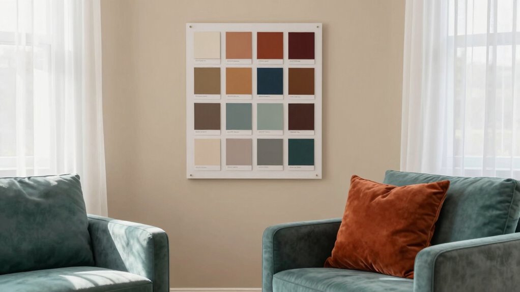
Before committing to large paint jobs, it’s essential to test your chosen colors with samples. This step ensures your selections look as good in your space as they do on the swatch. Use paint swatch comparisons to see how colors interact with your lighting and furnishings. Sample board testing allows you to view multiple shades side-by-side, making differences clear.
- Compare paint swatch samples next to each other to identify subtle differences.
- Create a sample board with your top choices to see how colors work together.
- Test samples in different lighting conditions to observe changes throughout the day.
These methods help refine your color choices, giving you confidence that your whole-home flow feels cohesive yet varied.
Common Mistakes to Avoid When Planning Your Home’s Color Flow
While testing your color choices helps guarantee they look good in your space, it’s just as important to be aware of common pitfalls that can disrupt your home’s cohesive flow. One mistake is ignoring paint color psychology, which influences mood and perception; choosing colors that clash or feel disconnected can break the flow. Additionally, overlooking lighting considerations can skew how colors appear in different rooms and times of day. Be cautious about *changing* between drastically different shades without a smooth progression, as this can feel jarring. Avoid over-matching or sticking to a single palette too rigidly—variety adds interest. *Finally*, neglecting to consider how each space connects visually can make your home feel disjointed instead of harmonized. Awareness of these pitfalls helps create a seamless, intentional color flow.
Frequently Asked Questions
How Do I Choose a Color Palette That Works Throughout My Home?
You choose a color palette by selecting a few complementary shades that set the mood and create harmony throughout your home. Focus on color coordination by combining neutral tones with accent colors to keep things cohesive yet interesting. Consider the mood you want each space to evoke, and guarantee your palette flows seamlessly from room to room. This approach keeps your home unified without feeling overly matched.
Can I Incorporate Different Textures With a Unified Color Flow?
Yes, you can absolutely incorporate different textures with a unified color flow. Use texture contrast to add visual interest and pattern mixing to keep things lively. For example, pair smooth painted walls with plush rugs or sleek furniture against textured throws. This juxtaposition creates depth, making your space feel dynamic without breaking the cohesive color palette. Embrace variety in materials while maintaining a consistent color story for a balanced look.
What Are Some Budget-Friendly Ways to Test Paint Colors?
To test paint colors on a budget, use color swatches or DIY testing methods. Purchase small sample pots or ask for free samples from your local store. Apply the paint on a large poster board or directly on your walls in small patches. Observe how the colors look at different times of day and lighting. This way, you can confidently choose hues that flow seamlessly through your home without overspending.
How Do Lighting Conditions Impact the Perception of Color Flow?
Lighting influences how you perceive color flow, so it’s like shining a flashlight on a painting—colors can look different under various conditions. Natural light reveals true hues, while artificial lighting may cast warm or cool tones, causing perception variation. To maintain a cohesive flow, test paint colors in different lighting throughout the day. This way, you’ll see how lighting influences your color choices and create a harmonious look.
Is It Better to Paint All Rooms at Once or Gradually Update?
It’s better to update gradually, as it allows you to focus on paint color coordination and room shift techniques over time. You can test new colors in one space, see how they flow into adjacent rooms, and make adjustments without feeling overwhelmed. This approach helps maintain a cohesive look, guarantees color harmony, and lets you enjoy the process of creating a seamless whole-home color flow at a comfortable pace.
Conclusion
Creating a cohesive color flow in your home isn’t just about matching shades; it’s about crafting a space that feels connected yet lively. When you play with hues, tones, and accents thoughtfully, you’ll notice how your home naturally flows—like a well-told story. Sometimes, it’s the little surprises—an unexpected pop of color or a subtle progression—that make the whole home feel intentional and warm. Trust your instincts and enjoy the process!