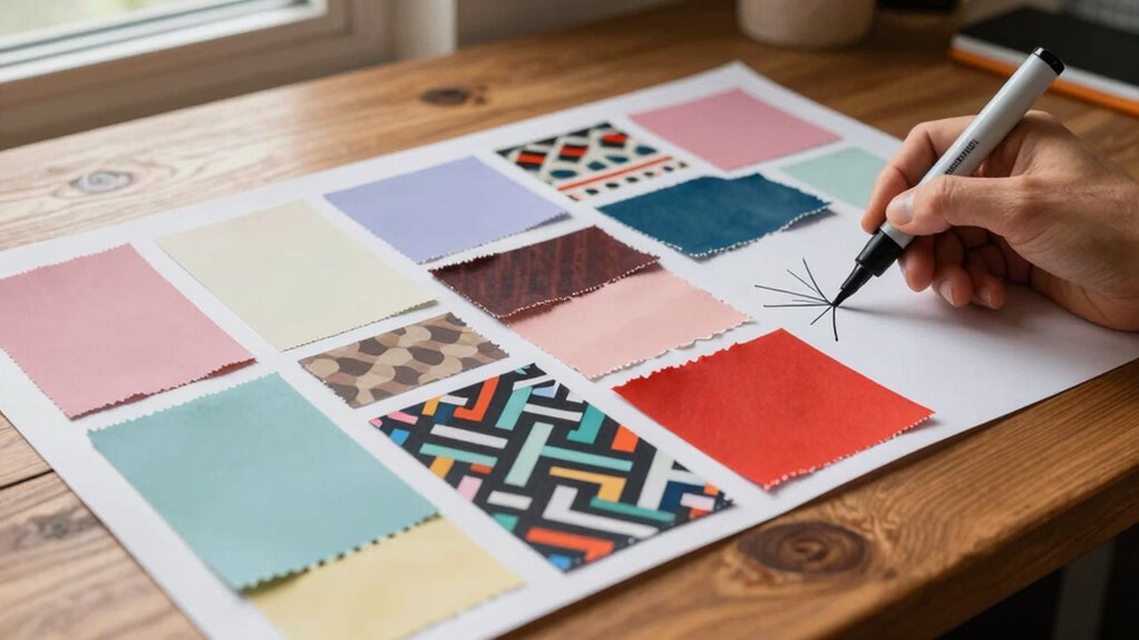

One of the biggest mistakes that can send your project in the wrong direction is choosing a poorly matched or inconsistent color palette. This can cause confusion, disrupt visual harmony, and make your moodboard feel disjointed. Without clear intent or a solid foundation, your ideas may veer off course, making communication difficult and revisions costly. If you keep these pitfalls in mind, you’ll discover how to create cohesive, impactful moodboards that truly support your project goals.

Get furniture and decor delivered free with Prime
- Fast, free delivery on millions of items
- Prime Video, Amazon Music and more included
- Member-only deals all year
Key Takeaways
- Choosing a random or inconsistent color palette can mislead the project’s emotional tone and overall direction.
- Starting a moodboard without a clear concept or purpose causes scattered visuals and confusion.
- Ignoring color psychology and emotional impact results in moodboards that don’t evoke the desired response.
- Lack of intentional planning leads to disjointed elements that undermine project cohesion.
- Failing to establish a solid foundation early causes costly revisions and misaligned final outcomes.
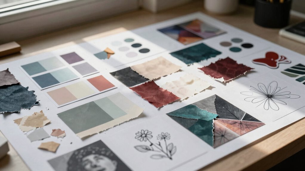
Have you ever spent hours creating a moodboard only to find that it misses the mark? It’s frustrating, especially when you’ve poured your energy into selecting images, textures, and colors that seem perfect at the time. Often, the problem isn’t the effort you put in but the way you approach the process. When you focus too heavily on assembling a visually appealing collection without clarity, you risk introducing a hidden mistake that can steer your project in the wrong direction. One of the biggest pitfalls is choosing a color palette that doesn’t truly reflect your vision or the message you want to convey. Instead of guiding your creative process, an ill-considered color palette can create confusion, making it harder to maintain consistency later on. This mistake can cause your project to feel disjointed, as if different elements don’t belong together, and it often leads to additional revisions down the line.
A mismatched color palette can derail your project and create confusion, leading to costly revisions and disjointed results.
The creative process requires intentionality, especially when it comes to developing a moodboard. If you jump into collecting images without a clear idea or theme, you might end up with a scattered collection that doesn’t serve your project’s goals. It’s tempting to gather pretty pictures, but if they don’t align with a cohesive color palette, your moodboard becomes just a visual jumble. This can be misleading, giving you a false sense of direction that’s difficult to follow once you start actual work. Instead, it’s better to start with a specific concept or emotion you want to evoke. From there, you can carefully select a color palette that supports that idea, ensuring every element you choose feels intentional and harmonious. Understanding the importance of visual consistency can help you create a more effective moodboard from the start. Additionally, paying attention to design principles like harmony and contrast can further strengthen the overall coherence of your project.
Failing to establish a solid foundation during the creative process often results in a moodboard that’s more aesthetic than functional. When your color palette isn’t well-defined, it’s easy for your project to veer off course because you lack a guiding principle. This mistake makes it harder to communicate your vision to clients or team members, leading to confusion and frustration. To avoid this, spend time refining your color choices early on, considering how each hue supports your overall concept. Think of your moodboard as a roadmap: the clearer your palette and theme, the more confident you’ll be moving forward. Incorporating visual harmony early in your process can save you time and resources later. Recognizing the significance of color psychology can also help ensure your moodboard effectively evokes the desired emotions and message.
color palette planner for designers
As an affiliate, we earn on qualifying purchases.
As an affiliate, we earn on qualifying purchases.
Frequently Asked Questions
How Do You Correct a Moodboard That Misguides a Project?
To correct a misguided moodboard, start by reassessing your chosen color palette and ensuring it aligns with your project’s goals. Remove elements that disrupt visual consistency and replace them with images that better reflect your desired style. Communicate with your team or client to clarify the vision, then update the moodboard accordingly. This process helps realign your project, making sure your visual direction stays cohesive and focused.
What Are Common Signs of a Misleading Moodboard?
You’ll notice a misleading moodboard when the color palette feels disconnected from the project’s goal or the material selection doesn’t match the intended style. If the visuals seem inconsistent or don’t evoke the right mood, it’s a sign. You might also see conflicting textures or hues that confuse the message. These signs indicate you need to re-evaluate the color palette and material choices to guarantee they align with your vision.
Can a Moodboard Be Too Detailed or Too Vague?
A moodboard can be too detailed like a tangled web, or too vague like a foggy morning. If your color palettes and iconography choices are overly specific, you might limit creativity and confuse your team. Conversely, if it’s too vague, it won’t provide enough direction, leaving everyone unsure. Aim for a balanced moodboard that offers clear inspiration without overwhelming or under-informing your project.
How Often Should Moodboards Be Updated During a Project?
You should update your moodboard regularly, especially when your project’s color palette or visual hierarchy evolve. This keeps your design cohesive and aligned with your goals. Typically, revisiting every few weeks or after major milestones helps guarantee your moodboard accurately reflects your direction. Frequent updates prevent miscommunications, help refine your vision, and assure all stakeholders stay on the same page, making your project smoother and more successful.
What Tools Are Best for Creating Effective Moodboards?
Think of creating moodboards like painting a picture—you need the right tools. Canva and Adobe Spark are fantastic for assembling visual hierarchies and experimenting with color palettes effortlessly. Pinterest is great for gathering inspiration, while Milanote offers a flexible workspace for organizing ideas visually. These tools help you craft moodboards that clearly communicate your vision, ensuring your project stays aligned and vibrant from start to finish.
Conclusion
So, next time you whip up a moodboard, remember: it’s not just a pretty picture; it’s the GPS for your project’s journey. Avoid the mistake of vague visions, or you’ll end up steering into a jungle of mismatched styles and missed deadlines. Think of your moodboard as your project’s crystal ball—if you misread it, you might as well be sailing a paper boat in a hurricane. Keep it clear, keep it sharp, and steer true.
Halloween Picks
halloween
As an affiliate, we earn on qualifying purchases.