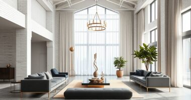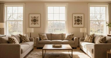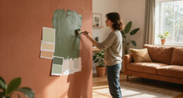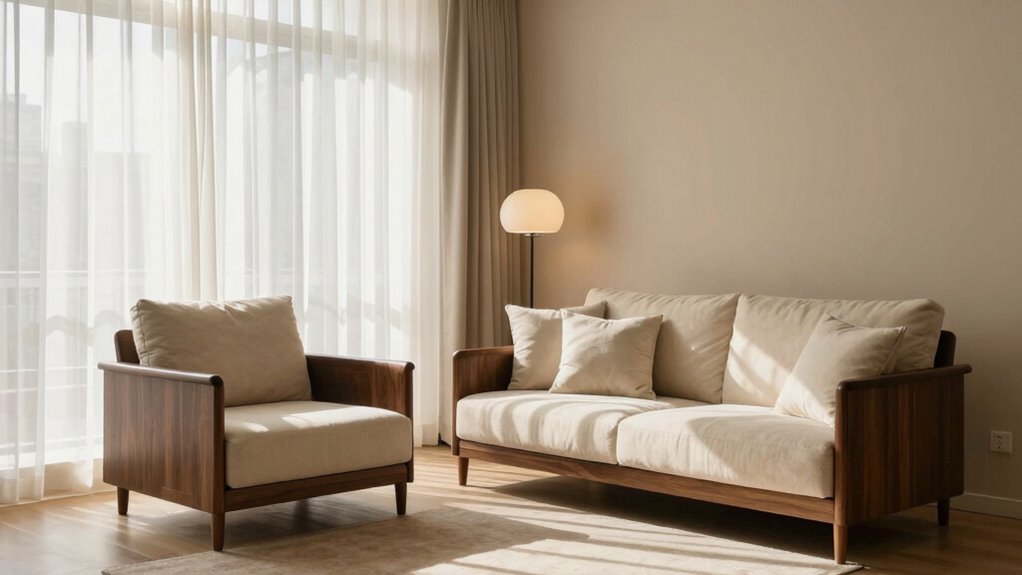

To use contrast without making a room feel harsh, focus on thoughtful color pairing and balance. Mix warm neutrals with cool shades, like beige with navy or terracotta with sage green, to create harmony. Introduce varied textures, combining smooth and rough surfaces evenly, and avoid overwhelming the space. Use lighting to soften contrasts and create a cozy ambiance. If you want to discover how to master the art of balanced contrast, explore more tips that can elevate your space effortlessly.

Get furniture and decor delivered free with Prime
- Fast, free delivery on millions of items
- Prime Video, Amazon Music and more included
- Member-only deals all year
Key Takeaways
- Balance bold colors with softer neutrals to create visual harmony and prevent overwhelming the space.
- Distribute contrasting elements evenly to maintain a sense of equilibrium and avoid heaviness.
- Incorporate a variety of textures to add depth without relying solely on color contrasts.
- Use warm, diffused lighting to soften contrasts and create a cozy, inviting atmosphere.
- Pair vibrant accents with subdued surroundings to highlight features without creating harsh visual clashes.
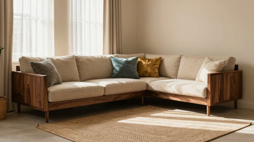
Contrast can add depth and interest to a room, but if not used carefully, it can also create a harsh or jarring atmosphere. The key is to balance bold elements with softer touches, allowing your space to feel dynamic yet inviting. One effective way to do this is through thoughtful color pairing. Instead of stark contrasts like black and white, opt for colors that complement each other. For example, pairing warm neutrals with cool shades creates a harmonious vibe that still provides visual interest. You might combine soft beige walls with navy accents or warm terracotta with sage green. These combinations give your room a lively feel without overwhelming the senses, making the contrast feel natural and pleasing. Incorporating biodiversity principles into your interior design can also inspire more balanced and nature-inspired color schemes, enhancing harmony within your space. Additionally, understanding visual balance can help you distribute contrasting elements evenly, preventing any part of the room from feeling too heavy or too sparse. Paying attention to color harmony ensures that your contrast remains cohesive and visually appealing. Texture mixing is another powerful tool. When you introduce varying textures into your space, you add layers of visual and tactile interest. Imagine pairing a sleek, smooth leather sofa with a plush, textured throw or a matte-finished table with glossy accessories. The contrast in textures enhances the room’s depth without creating chaos. The trick is to balance rough and smooth, shiny and matte, soft and hard. This way, your eye moves comfortably around the space, noticing differences without feeling assaulted by them. You also want to ponder the proportion and placement of contrasting elements. If you have bold colors or heavy textures, balance them with more subdued or softer elements. For instance, if you choose a vibrant, patterned rug, keep the surrounding furniture in neutral tones. If you opt for textured cushions or curtains, make sure they’re not all competing for attention—spread out the contrast evenly across the room. This prevents any one area from feeling too stark or overwhelming. Lighting plays a vital role in how contrast appears. Proper lighting can soften harsh lines or amplify subtle differences. Use warm lighting to create a cozy ambiance that balances out bold contrast. Avoid harsh, direct light that can make contrasting colors and textures appear too intense. Instead, layer your lighting with a combination of ambient, task, and accent lights to highlight your contrasting design features gently. When you approach contrast thoughtfully, you’ll craft a room that’s visually engaging yet comfortable—never harsh or jarring. Recognizing the impact of lighting on contrast can help you achieve the desired mood more effectively.
neutral and accent color throw pillows
As an affiliate, we earn on qualifying purchases.
As an affiliate, we earn on qualifying purchases.
Frequently Asked Questions
Can Contrast Be Used in Small Rooms Effectively?
Yes, you can use contrast effectively in small rooms by understanding contrast psychology and maintaining visual balance. Opt for subtle contrasts, like light and dark shades within the same color family, to create depth without overwhelming the space. Use contrasting accessories or artwork sparingly to add interest. This approach keeps the room feeling open and balanced, making the contrast work to enhance the space rather than making it feel cramped or harsh.
What Are the Best Color Combinations for Subtle Contrast?
For subtle contrast, choose calming color combinations like soft grays and gentle beiges or muted blues and warm whites. These create a pleasing palette that promotes color harmony and visual balance. You want your room to feel cohesive and calm, so avoid stark contrasts. Instead, opt for shades that complement each other, blending seamlessly while adding just enough variation to keep things interesting without overwhelming.
How Do Lighting Choices Affect Contrast in a Room?
Lighting choices greatly influence contrast in your room by enabling lighting layering, which adds depth and dimension. Using a mix of ambient, task, and accent lights creates subtle contrasts without harshness. Soft, warm lighting enhances mood, making the space feel inviting and balanced. Proper lighting layering allows you to highlight different areas while maintaining a harmonious contrast, ensuring the room feels lively yet comfortable without being overwhelming.
Is Contrast Suitable for All Interior Design Styles?
Contrast suits many interior styles, but it’s like seasoning—used wisely, it enhances without overpowering. Think of a minimalist space with monochrome harmony and subtle texture variation; it’s sleek yet inviting. An eclectic room, meanwhile, thrives on bold contrasts. While some styles embrace high contrast, others favor softer tones. Ultimately, understanding your style helps you balance contrast, creating a space that feels cohesive and lively without feeling harsh.
How Can I Balance Contrast With Existing Decor?
You can balance contrast with your existing decor by adding decorative accessories that pick up on contrasting colors or textures, creating visual interest without overwhelming the space. Incorporate wall textures like textured paint or wallpaper to add depth subtly. Keep some elements neutral to soften the contrast, allowing bold pieces or textures to stand out without making the room feel harsh. This approach maintains harmony while highlighting key features.
Conclusion
By gently weaving contrast into your space, you’re painting a masterpiece that dances with depth and harmony. Think of it as adding a splash of bold color to a soft canvas—enough to intrigue, but not overwhelm. With a delicate touch, your room becomes a symphony of balance, where each element sings in perfect harmony. Embrace the art of subtle contrast, and watch your space transform into a welcoming haven, rich with character and warmth.
Fall Picks
fall essentials
As an affiliate, we earn on qualifying purchases.