Have you ever walked into a room and felt an immediate wave of emotion wash over you, all just from the colors surrounding you? Color is a powerful influencer in our lives and can profoundly impact our perceptions and feelings. Whether you’re designing a living space, branding your business, or creating a stunning piece of art, learning how to choose the right color palette is key to achieving the desired visual appeal. With proper understanding of color theory and the psychology behind colors, you can create combinations that evoke emotion or elicit action, resulting in a memorable impact on your audience. From cool blues that calm the spirit to warm reds that ignite excitement, mastering color harmony is essential for any project. The choices you make will not only reflect your brand identity but also connect with the hearts of those who experience your work12.
Key Takeaways
- Understanding color psychology is crucial for effective design.
- Colors can evoke powerful emotions and perceptions.
- Harmonizing cool and warm tones helps create a balanced palette.
- Effective color combinations enhance brand identity.
- Color has a significant impact on consumer behavior and product assessment.
Understanding Color Theory
Grasping the basics of color theory can transform your approach to design. The color wheel serves as a fundamental tool, illustrating the relationships between colors. It consists of three primary colors—blue, yellow, and red—which, when mixed, create secondary colors like green, orange, and purple. When you take it a step further and mix secondary colors with primary ones, you develop six tertiary colors such as blue-green and red-orange3.
The Color Wheel Explained
Sir Isaac Newton designed the first color wheel in 1666, showcasing how colors interconnect. It functions as a baseline for understanding general interpretations of color, helping you process color combinations effectively. Complementary colors, located opposite each other on the color wheel, provide unique harmony, while triadic color schemes can create bold, dynamic palettes43.
Primary, Secondary, and Tertiary Colors
Understanding the classification of colors is vital. Primary colors are the building blocks from which all other colors are formed. Mixing these primary colors creates secondary colors and further mixing results in tertiary colors. You might consider warm colors like reds, oranges, and yellows as energetic, while cool colors such as blues, greens, and purples inspire calm and tranquility43.
Warm vs. Cool Colors
Warm colors, usually associated with energy, tend to evoke feelings of excitement. In contrast, cool colors create a serene atmosphere, making them suitable for various settings and purposes. Recognizing this distinction can influence your design choices and help you better connect with your audience43.
The Psychology of Color
Color psychology explores how different hues can elicit various emotions and responses. For instance, bright warm shades are impactful in lively environments, while softer tones have a calming effect. Your understanding of this psychology will significantly inform your design decisions and audience engagement strategies, as people make quick judgments based on color—up to 90% of their decision-making occurs within 90 seconds and is largely influenced by color4.


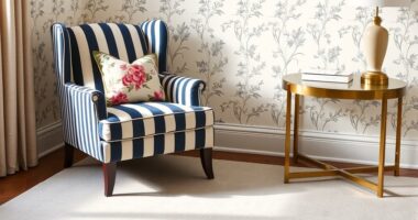
Interior Design Color Wheel Helps You Harmonize Your Interior Design Projects.
- Brand: COLOR WHEEL
- Category: Sticker Decal
As an affiliate, we earn on qualifying purchases.
As an affiliate, we earn on qualifying purchases.
Identifying Your Purpose
Establishing a clear design purpose is crucial when developing a color palette. Understanding your project goal will guide your color selection, ensuring that everything aligns with your overall vision. You must also consider your target audience’s preferences, as these will play a significant role in how your design is received.
What Is the Project Goal?
Your project goal serves as the foundation for your color choices. By defining this goal, you can select colors that effectively communicate your intended message. A well-defined and consistent color palette helps establish a memorable first impression, especially in a competitive market5.
Target Audience Considerations
Understanding your target audience is essential for successful design. Different colors can evoke specific feelings; for example, green is often associated with nature and sustainability, making it popular among eco-conscious brands5. You should also consider how individuals are naturally drawn to certain colors, as these preferences can affect their experience with your design6.
Functionality versus Aesthetics
Balancing functionality and aesthetics in your design is vital. Each color can carry specific meanings; red may symbolize energy, while blue represents trust and stability6. Designers should create a clear visual hierarchy by assigning specific colors to different types of information or actions within the app interface, ensuring that functionality does not get overshadowed by aesthetic decisions7. Ultimately, careful consideration of both elements will enhance user experience while effectively portraying your design purpose.

Colors evoke emotions and associations; select wisely to connect with your audience.
| Color | Meaning | Usage Example |
|---|---|---|
| Red | Energy, love, passion | Used in marketing for sales or urgency |
| Blue | Trust, wisdom, stability | Common in financial institutions |
| Green | Growth, nature, sustainability | Preferred in eco-friendly brands |
| Yellow | Optimism, happiness | Frequent in promotional materials |
Analyzing Existing Elements
When choosing a color palette, you should take a moment to analyze existing elements that could significantly influence your selections. This includes reviewing current branding colors, considering seasonal trends, and evaluating surrounding colors to ensure harmony in your designs.
Reviewing Current Branding Colors
Your current branding colors serve as a foundation for further exploration. These colors need to resonate with your brand identity while being visually appealing. Custom palettes based on brand colors can enhance visualization effectiveness, making it crucial to align any new choices with existing elements8. Additionally, consider the nuances of color perception as daylight significantly impacts how colors appear; morning and evening light alter their visual characteristics9.
Considering Seasonal Trends
Seasonal trends provide a timely influence on color choices. For example, spring’s pastels or autumn’s rich tones can evoke specific emotions that align with your target audience’s preferences. Recognizing these trends not only aids in color evaluation but also helps in creating a design that feels relevant10. It’s essential to evaluate how your palette could shift with the seasons while maintaining your branding integrity.
Evaluating Surrounding Colors
The surrounding colors within your space or design context cannot be overlooked. Shadows and existing furniture or décor can impact your color perception, making some hues appear darker or duller9. You should aim for a color contrast ratio that meets accessibility guidelines, as a minimum contrast of 3:1 for non-text elements is recommended10. Light hues on ceilings can create illusions of height, enhancing your overall color evaluation strategy.

Exploring Different Color Schemes
When it comes to selecting the right color schemes, understanding the fundamentals is crucial. Choosing the right color scheme can significantly influence the overall tone and feel of your project. Below, you’ll find insights into three widely used color schemes: monochromatic, complementary, and analogous.
Monochromatic Color Schemes
Monochromatic schemes utilize shades, tints, and tones of a single color. This approach can create a harmonious and cohesive look, allowing for versatility in design without overwhelming the viewer. By focusing on variations in saturation and brightness within a single hue, designers can effectively evoke specific emotions through richness in color.
Complementary Color Combinations
Complementary colors are pairs of colors that, when combined, cancel each other out, producing a grayscale color. This type of scheme is particularly striking, as it provides high contrast that often draws attention. You can use it to create dynamic visual effects that are powerful in engaging the audience. According to design principles, the 60-30-10 rule helps distribute these colors effectively across the project, ensuring brand identity is established with clarity11.
Analogous Color Palettes
Analogous colors are located next to each other on the color wheel, offering a subtle blend of colors that are pleasing to the eye. This scheme provides an easy way to create a serene and comfortable design. It is particularly useful in settings where a more relaxed atmosphere is desired. By combining these colors, you can achieve a more gentle transition that enhances the overall aesthetic appeal of your project.

| Color Scheme | Characteristics | Best Uses |
|---|---|---|
| Monochromatic | Same hue with varying saturation and brightness | Minimalistic designs, branding consistency |
| Complementary | High contrast colors from opposite sides of the wheel | Attention-grabbing ads, dynamic visuals |
| Analogous | Colors next to each other on the wheel | Relaxed themes, nature-inspired designs |
Understanding how to mix these color schemes can elevate your designs. Pay attention to the context in which these color schemes are applied to maximize their effectiveness. Ultimately, the right choice will align perfectly with your project’s goals and audience expectations12.
Finding Inspiration
Discovering color inspiration can significantly enhance your design choices. By looking closely at nature and art, you can uncover a wealth of design references that resonate with your vision.
Nature as a Color Guide
Nature offers a powerful palette of colors that can influence your projects. The vibrant array of hues found in a landscape can inspire unique color combinations, allowing your designs to reflect organic beauty. For instance, warm colors like red, orange, and yellow can convey energy, while cool colors such as blue and green evoke tranquility. This synergy between nature and color psychology shows how your palette can deeply affect emotional responses to your designs13.
Art and Design References
Art serves as a rich source for color inspiration. Various movements, from Impressionism to Modernism, showcase varying techniques in color usage that can influence contemporary design. Analyzing different artworks allows you to generate innovative palettes. Photographs can be particularly useful, as utilizing personal collections or exploring platforms like Pinterest or Google image searches can help you identify striking color combinations13. Additionally, consider successful interior design palettes, which often utilize 3 to 5 well-coordinated colors to create harmonious spaces14.
Online Resources and Tools
Many online resources and color tools exist to streamline your color selection process. Platforms like Coolors and Canva facilitate easy palette generation, allowing you to extract colors from images and experiment with shades14. Color Hunt provides a vast library to browse through potential palettes, focusing on balancing warm and cool tones effectively. These digital tools are essential for any designer looking to enhance their work with sophisticated color choices.

Testing Your Color Choices
When selecting the perfect color palette, the practicality of testing your color choices becomes paramount. Employing color swatches provides a tangible way to visualize how different colors interact in your space. This hands-on approach can illuminate whether your color selections align with your vision for the project. Gathering valuable feedback from others is equally essential, as diverse perspectives can enhance your palette and ensure it resonates with your intended audience.
Using Color Swatches
Color swatches serve as an effective tool in determining how your selections will look in real life. These samples allow you to examine color accuracy under various lighting conditions, facilitating better decision-making. Consider applying the 60-30-10 rule, where 60% of your room showcases a primary color, 30% features a secondary color, and 10% an accent hue for a balanced aesthetic15. For instance, pairing vibrant colors with muted tones can create a harmonious environment that is visually appealing and inviting.
Digital Tools for Visualization
Digital visualization allows you to experiment with color choices in a virtual setting. Tools like Paletton are designed to assist a wide array of users—from professional designers to beginners—promoting creativity and innovation in your color selections16. These platforms encourage experimentation with different color combinations, simplifying the color selection process while enabling you to envision the final outcome before any physical changes are made.
Gathering Feedback from Others
Receiving feedback on your color choices can provide insightful guidance. Engaging trusted colleagues or friends can help identify elements you may have overlooked and enhance the overall appeal of your palette. Studies suggest that websites designed with optimal color palettes are more likely to attract repeat visitors, highlighting the critical role that feedback plays in refining color aesthetics16. Ultimately, your goal should be to create a color scheme that resonates well with others, balancing personal taste with general appeal.

Incorporating Textures and Patterns
When it comes to creating engaging spaces, incorporating textures and patterns can significantly enhance your design. By adding depth with various textures, you can evoke different moods within a room. Different materials like velvet, wood, bouclé, linen, and marble bring contrasting textures to a space, contributing to the overall mood and feel of a room17. You can effectively use textures to provide an inviting atmosphere while maintaining excellent visual appeal.
Adding Depth with Textures
To achieve depth in your design, consider using a mix of textures that vary in feel and appearance. Incorporating rough, smooth, matte, and glossy surfaces can create intriguing interactions and visual interest18. For instance, thicker jute options like Coast and Spectator provide strong wood-like hues in their color and weaving17. By blending textures, you can make a space feel more dynamic and layered, thus elevating your design.
Balancing Patterns with Color
Mixing patterns requires a thoughtful approach to balance with your chosen colors. The commonly recommended 60-30-10 rule is an excellent guideline for mixing prints: allocate 60% to the main pattern, 30% to a secondary pattern, and 10% to an accent pattern18. When combining patterns, using wallpaper that matches the colors within the pattern can lead to beautiful outcomes, ensuring a cohesive look across your design17.
When to Keep It Simple
While textures and patterns can breathe life into a room, simplicity sometimes reigns supreme. Neutral color schemes, such as white, tan, gray, or cream, provide a solid foundation to create a cohesive design without overwhelming the senses18. When working with a neutral base, you can play with different shades of one color to add depth without creating a busy look. Remember, having a mix of styles is essential, but keeping certain areas simple can lead to a harmonious overall appearance19.

| Material | Texture Type | Effect |
|---|---|---|
| Velvet | Soft | Luxurious feel |
| Wood | Rough/Smooth | Natural warmth |
| Bouclé | Textured | Cozy vibe |
| Linen | Natural | Light and airy |
| Marble | Sleek | Modern elegance |
This table illustrates how different materials can create distinct textural experiences, further emphasizing the importance of textures in your design choices.
Incorporating variations of textures and patterns not only adds depth but also creates a delightful sensory experience within your space. With a thoughtful balance and an eye for simplicity, you can craft a design that truly resonates17.
Adapting to Different Mediums
Understanding how color choices adapt to various mediums is crucial for achieving the desired impact. Different platforms necessitate unique approaches, particularly when discussing print design versus digital design. Each medium has its own characteristics that can affect how colors are perceived and interact with other elements.
Print vs. Digital Color Schemes
Print design typically relies on the CMYK color model, allowing for rich and vibrant hues on paper. On the other hand, digital design uses the RGB model, which may look different when printed due to its inherent light-based properties. When transitioning between these two mediums, it is vital to consider how colors translate. For example, blue is known for its calming effects, making it ideal for environments focused on productivity20. In contrast, colors like red can be bold and energizing, effectively drawing attention in both print advertisements and websites.
Color Variations for Clothing and Interiors
In fashion and interior design, color variations play a pivotal role in setting the mood and functionality of spaces. Green, associated with nature, cultivates creativity and focus, making it a popular choice for both clothing lines and home decor20. Additionally, recent trends lean towards nature-inspired hues for a calming aura that resonates well within industrial and modern settings20. Incorporating metallic finishes can add a touch of luxury, elevating the overall aesthetic significantly.
Customizing for Social Media Platforms
Social media customization requires an acute awareness of how colors impact user engagement. Each platform has its unique audience expectations and best practices. For instance, using vibrant colors like yellow can uplift mood and foster creativity, essential for platforms focused on innovation and trending content20. When designing for social media, one must also consider color accessibility, which includes adhering to Web Content Accessibility Guidelines (WCAG) that establish contrast ratios for legibility21. Understanding your audience’s perception of colors helps in tailoring your color palette effectively for maximum engagement.

Adapting your color choices across different platforms ensures a cohesive look that appeals to your target demographic.2021
Ensuring Accessibility
Design inclusivity begins with color accessibility, allowing all users to engage with visual content effectively. The concept of color contrast plays a vital role in ensuring that text stands out against its background, ensuring readability for everyone. According to WCAG guidelines, a contrast ratio of 4.5:1 is recommended for normal text, while large text should achieve a ratio of at least 3:1 to enhance accessibility22. Over 2.2 billion people globally face visual impairments, highlighting the need for careful color selection22.
Understanding Color Contrast
Adhering to recommended contrast ratios is essential not only for aesthetic reasons but also for safety and compliance. For 18 pt text and larger, a color contrast ratio of 3.1 is acceptable under WCAG guidelines22. As the World Health Organization notes, 1.3 billion individuals live with some form of vision impairment, necessitating an understanding of how color choices impact their experiences23.
Tools for Color Accessibility
Utilizing tools for color accessibility can significantly enhance your design practices. Plugins like Stark Sketch and Tanaguru assist designers in calculating contrast ratios and ensuring compliance with accessibility standards23. Such resources can be invaluable in creating inclusive designs that cater to diverse audiences.
Designing for Color Blindness
When aiming for design inclusivity, it’s crucial to consider color blindness. Ten examples of accessible color palettes and templates showcase various options, including vibrant, monochromatic, and contrasting schemes that accommodate those with color vision deficiencies22.

Creating a Cohesive Palette
Establishing a cohesive palette is vital for any design project. It begins with selecting a dominant color that defines the overall aesthetic. This dominant color serves as the foundation of your palette and sets the tone for your project, ensuring that everything else harmonizes well.
Selecting a Dominant Color
Choosing the right dominant color requires an understanding of color theory, specifically the color wheel, which includes primary, secondary, and tertiary colors. Utilizing colors that evoke emotions can enhance user experience. Talented designers often choose hues based on their psychological impact, aiming to create specific moods and convey non-verbal messages24.
Finding Supporting Colors
Once you determine your dominant color, it’s crucial to find supporting colors that complement it. Look to create a balanced color scheme, using either monochromatic or analogous palettes for subtlety25. Employing a color wheel can help you visualize relationships between different hues and select colors that combine well, such as analogous colors or creating color chords with harmonious schemes24.
Balancing Neutrals and Accents
Integrating neutral colors provides a backdrop that enhances the vibrancy of supporting colors. A solid neutral foundation is essential to achieve a neutral balance, acting both as a calm element and a contrast to richer tones. When you incorporate accents, opt for bold shades that draw the eye while retaining overall cohesion throughout your design26.

Developing a Color Palette Document
Creating a color palette document is an essential step in ensuring design consistency and effective communication. This document should include detailed annotations and guidelines for usage, sample mockups, and exemplars that illustrate the application of the color choices. By incorporating these elements, you enhance team collaboration and foster a clear understanding of the design principles at play.
Annotations and Usage Guidelines
Annotations play a crucial role in your color palette document, serving as a guide for how and when to use each color. Include details such as:
- Color meanings: Explain the psychological impact of each color.
- Specific applications: Indicate where each color works best, such as backgrounds, typography, or accent elements.
- Accessibility notes: Ensure that colors meet WCAG 2.0 standards to accommodate all users.
Sample Mockups and Examples
Sample mockups are invaluable for demonstrating how your selected colors will appear in real-world applications. By using visual examples, you can showcase:
- Branding materials.
- User interface components.
- Promotional graphics.
These mockups should reflect various scenarios to illustrate the versatility and effectiveness of your chosen palette27
Sharing with Your Team
Engaging your team in the color selection process fosters better alignment with the overall vision of the brand. Use collaborative tools and platforms to share the color palette document, making it easy for everyone to access and provide feedback. Schedule regular reviews to discuss any necessary changes or updates, ensuring that all team members feel involved in the creative journey. This open exchange is key to effective team collaboration2829.
Updating Your Palette Over Time
In the ever-evolving world of design, updating your color palette is crucial for keeping your work relevant and engaging. By staying informed about design trends, you can ensure that your visuals resonate with the audience while reflecting your brand’s identity. Recognizing when to refresh or alter your palette will help you maintain a fresh perspective in your creations.
Evolving Trends and Styles
Design trends shift rapidly, often influenced by cultural movements and seasonal changes. As a designer, embracing these changes can breathe new life into your projects. Utilizing tools like Color Me Beautiful or similar resources enables you to explore the 12 updated color types, helping to adapt your design style with updated palettes that resonate with contemporary aesthetics30.
Keeping Your Brand Fresh
Consistent attention to your brand refresh is key for standing out in a competitive market. A successful color palette often includes 3 to 5 main colors, enabling you to create engaging visual experiences14. Regular updates, such as incorporating seasonal color adjustments, allow you to convey freshness while ensuring your brand remains relevant. For instance, implementing the latest color trends can draw in a new audience, showcasing that your brand is in tune with current preferences.
Seasonal Adjustments
Making seasonal adjustments to your color palette serves to reflect the changing moods and aesthetics throughout the year. By introducing tints or shades that align with the season—such as warm tones in the fall or vibrant pastels in spring—you can create a visually dynamic experience. Consider experimenting with various color combinations that may evoke different feelings or connections during different seasons. Add a splash of uniqueness to your projects as you explore available tools like the Coolors or Canva apps for further assistance14.

Resources for Color Palette Selection
When it comes to selecting the perfect color palette, access to various resources can make your journey much smoother. Engaging with reputable design books, online courses, and workshops can deepen your understanding of color theory and application. Additionally, mobile apps are excellent tools for experimenting and refining your color choices on the go.
Books and Online Courses
There are numerous design books that delve into color theory, offering both theoretical and practical insights. Look for those that align with your specific design goals. Online courses provide structured learning experiences. They often include video tutorials, interactive assignments, and community feedback, which can be essential for mastering color selection.
Workshops and Seminars
Design workshops offer hands-on opportunities to engage directly with peers and instructors. Attending these events allows you to collaborate in real-time, receive valuable feedback, and learn from experienced professionals. Keep an eye out for local or virtual workshops that focus on color palette creation.
Mobile Apps for Designers
To facilitate your design process, there are multiple mobile apps available. For example, Coolors enables the quick creation and sharing of color schemes, making it a favorite among over 5 million designers and companies31. Pigment by Shapefactory is recognized as the top online color palette generator for designers32. With apps like ColourCode and Colordot, you can develop color palettes intuitively, optimizing your workflow and creativity32.

Final Thoughts on Color Selection
Choosing the right color palette is a journey that embraces both the essence of your brand identity and the emotional impact that colors can have on your audience. A thoughtfully constructed palette communicates your unique message, helping to differentiate your brand in a competitive landscape. Remember, color selection plays a significant role in defining your brand, as different colors evoke various emotions; for instance, bright colors often symbolize high energy while more subdued tones may represent sophistication33.
Reflecting Your Brand Identity
Your color choices should resonate with your target audience, creating a memorable connection that encourages loyalty. Research indicates that an understanding of audience preference is crucial, as colors should reflect their tastes and expectations to foster a lasting impression33. Implementing the 60-30-10 rule can also enhance your design’s structure, ensuring that your palette complements and reflects your brand’s personality while allowing for a balanced visual aesthetic34.
The Power of Color in Design
The emotive strength of color in design cannot be overlooked; it plays a pivotal role in capturing attention and conveying messages effectively. Utilizing multiple hues can lead to a well-rounded design reflection; however, achieving harmony through complementary schemes is vital for visual appeal33. Embracing the creative process enhances your ability to experiment, a practice that fosters personal expression and leads to designs that resonate on multiple levels with your audience.
Embracing the Creative Process
Ultimately, the art of color selection invites you to explore and refine your choices continuously. With every attempt, you learn more about the impact of color in design and its significance in expressing your brand and personality. By engaging in this creative journey, you not only evolve as a designer but also create spaces and products that truly inspire and connect34.
FAQ
Why is choosing the right color palette important for my project?
Selecting the appropriate color palette can significantly influence your project’s visual appeal, enhance brand identity, and affect emotional responses from your audience. The right colors create a harmonious environment that resonates with your target market.
What is color theory and how can it help me?
Color theory is a set of principles that explains how colors interact with each other. By understanding the color wheel, primary, secondary, and tertiary colors, and the differences between warm and cool colors, you can make informed decisions that enhance the effectiveness of your design.
How can I define my project’s purpose in relation to color selection?
Clearly outlining your project’s goal and understanding your target audience’s preferences will help you choose colors that serve both functionality and aesthetic appeal, ensuring your design achieves its intended purpose.
What existing elements should I consider when selecting colors?
It’s important to review your current branding colors, consider seasonal trends, and evaluate any surrounding colors that your design will interact with. This will ensure your chosen palette harmonizes with the overall environment.
What are the different types of color schemes I can use?
You can explore various color schemes, including monochromatic, complementary, and analogous palettes. Each scheme creates different moods and visual effects that can enhance your design goals.
Where can I find inspiration for color selection?
Inspiration can often be found in nature, art, and design references. Additionally, numerous online resources and tools are available to streamline your color selection process and spark creativity.
How should I test my color choices before finalizing them?
It’s beneficial to use color swatches and digital visualization tools to see how your colors work together in real life. Seeking feedback from others can also provide insights and help you make adjustments before finalizing your palette.
Can textures and patterns be incorporated into my color palette?
Absolutely! Textures add depth and interest to a design, while ensuring a balance between patterns and chosen colors will help achieve a unified look. Remember, simplicity can also play a crucial role in maintaining harmony.
How do color palettes vary between different mediums?
Color choices can differ significantly between print and digital formats, as well as in fashion and interior design. It’s essential to customize your color palette for each medium to enhance visual engagement effectively.
Why is color accessibility important in design?
Ensuring color accessibility is vital for readability and usability. Understanding color contrast, utilizing accessibility tools, and designing with color blindness in mind can lead to more inclusive and effective designs.
What steps can I take to create a cohesive color palette?
Start by selecting a dominant color that reflects your brand or project’s essence. From there, you can find supporting colors, and ensure a balanced use of neutrals and accents for an integrated look.
How do I create a color palette document?
A color palette document should include annotations, usage guidelines, and sample mockups to effectively communicate the palette’s application. This document can ensure team alignment during the design process.
When should I update my color palette?
Regular updates are essential to keep your designs contemporary. Staying attuned to evolving trends, styles, and making seasonal adjustments will help maintain brand relevance.
What resources are available for learning about color palette selection?
There are numerous resources, including books, online courses, workshops, and mobile apps, that can deepen your understanding and skills in color design, aiding you in making informed choices.
How can color reflect my brand identity?
A well-crafted color palette can encapsulate your brand’s essence and values. By integrating specific hues that resonate emotionally with your audience, you can strengthen brand identity and improve overall design effectiveness.
Source Links
- https://stylebyemilyhenderson.com/blog/how-to-choose-your-perfect-color-palette – How To Choose Your Perfect Color Palette – Emily Henderson
- https://careerfoundry.com/en/blog/ui-design/introduction-to-color-theory-and-color-palettes/ – Color Theory And Color Palettes — A Complete Guide [2025]
- https://witanddelight.com/2020/07/a-color-skeptics-guide-to-color-theory-in-design/ – Color Theory and How to Apply it to Your Home’s Design | Wit & Delight
- https://99designs.com/blog/tips/the-7-step-guide-to-understanding-color-theory/ – The bold, bright truth about color theory
- https://www.squarespace.com/blog/brand-colors – How to Choose Brand Colors: Examples and Best Practices – Squarespace
- https://www.lemonandthesea.com/blog/how-i-choose-a-color-palette – How I Choose a Color Palette for My Clients
- https://cieden.com/book/sub-atomic/color/choosing-colors-for-app-purpose – How do I choose colors that align with the app’s purpose and functionality?
- https://www.atlassian.com/data/charts/how-to-choose-colors-data-visualization – Data Viz Color Selection Guide | Atlassian
- https://www.deninejacksoninteriors.com/design-blog/the-ultimate-guide-to-choosing-the-right-color-palette-for-your-home – Choosing the Perfect Color Palette: A Complete Guide
- https://matthewstrom.com/writing/how-to-pick-the-least-wrong-colors/ – How to pick the least wrong colors
- https://www.uxpin.com/studio/blog/choose-color-pallete/ – Choosing a Color Palette for Your Project
- https://designerup.co/blog/how-to-pick-perfect-color-palettes-every-eime-no-plugins-or-color-generators/ – How To Pick Matching Color Palettes Every Time (No Plugins or Color Generators)
- https://theoutdoorsyartist.com/finding-color-palette-inspiration/ – How to Find Color Palette Inspiration
- https://thegempicker.com/interior-color-palette/ – How to Pick a Cohesive Color Palette for Interior Design | The Gem Picker
- https://www.interiorsbysteveng.com/how-do-i-choose-the-right-color-palette-for-my-interior-design-project/ – How Do I Choose the Right Color Palette for My Interior Design Project?
- https://paletton.com/ – Paletton – The Color Scheme Designer
- https://grasscloth.twenty2.net/blogs/grassroots/how-to-use-patterns-textures-in-interior-design-learn-the-differences-mixing-rules-more – How to Use Patterns & Textures in Interior Design: Learn the Differences, Mixing Rules & More
- https://www.yolointeriors.com/mixing-patterns-textures-interior-design/ – How to Mix Patterns and Textures Like a Pro | Yolo Interiors
- https://www.jackiebarnesdesign.com/blog/how-to-mix-color-patterns-textures-for-home-interior-design – How to Mix Colors, Patterns, and Textures in Home Interior Design
- https://cmmonline.com/articles/choosing-the-right-color-palette – Choosing the Right Color Palette | Cleaning & Maintenance Management
- https://medium.com/thinking-design/adaptive-color-in-design-systems-7bcd2e664fa0 – Adaptive Color in Design Systems
- https://venngage.com/blog/accessible-colors/ – Guide to Accessible Colors Palettes [Templates Included]
- https://medium.com/envoy-design/how-to-design-an-accessible-color-scheme-4a13ca12c92b – How to design an accessible color scheme
- https://affinityspotlight.com/article/11-ways-to-find-cohesive-colour-palettes-for-your-designs/ – 11 ways to find cohesive colour palettes for your designs – Affinity Spotlight
- https://www.workovereasy.com/2018/07/12/how-i-put-together-a-coherent-colour-palette/ – How I Put Together a Coherent Colour Palette
- https://chrislovesjulia.com/create-a-cohesive-home-color-palette/ – Create a Cohesive Home Color Palette – Chris Loves Julia
- https://mariahalthoff.com/blog/create-perfect-color-palette – How to Create the Perfect Color Palette for your Brand — Mariah Althoff – Graphic Design + Freelancing Tips
- https://www.smashingmagazine.com/2010/02/color-theory-for-designer-part-3-creating-your-own-color-palettes/ – Color Theory for Designers, Part 3: How To Create Your Own Color Schemes
- https://figr.design/blog/creating-a-color-palette-for-your-design-system-practices-and-tips – Creating a Color Palette for Your Design System: Practices and Tips – My Framer Site
- https://anuschkarees.com/blog/2013/09/24/colour-analysis-part-i-finding-your-type – Colour Analysis Part I: Finding your Type — Anuschka Rees
- https://coolors.co/ – Coolors – The super fast color palettes generator!
- https://snappa.com/blog/color-palette-inspiration/ – 13 Helpful Resources for Color Palette Inspiration
- https://getdevdone.com/blog/what-to-consider-when-choosing-a-color-palette.html – What to Consider When Choosing a Color Palette – GetDevDone Blog
- https://www.stonegableblog.com/color-palette-and-decorating-style/ – Mastering The Art of Choosing The Perfect Color Palette