
To create a perfect color palette that flows, start by understanding basic color theory and choose a dominant hue that sets your tone. Use harmonious schemes like analogous or monochromatic colors for cohesion, and add accents for visual interest. Consider your environment and audience to select colors that evoke the right emotions. Test and refine your choices by experimenting with shades and gathering feedback. Keep exploring these principles to craft a seamless, emotionally impactful palette.
Key Takeaways
- Select a dominant color that sets the tone and use supporting colors that complement or harmonize with it.
- Use color schemes like analogous or monochromatic for a smooth, natural flow.
- Consider the context and environment to ensure colors resonate appropriately in their setting.
- Test your palette across different devices and lighting conditions to refine color balance and harmony.
- Incorporate principles of color psychology and cultural meanings to evoke the intended emotional response.

The Pocket Complete Color Harmony: 1,500 Plus Color Palettes for Designers, Artists, Architects, Makers, and Educators
- Title: The Pocket Complete Color Harmony
As an affiliate, we earn on qualifying purchases.
As an affiliate, we earn on qualifying purchases.
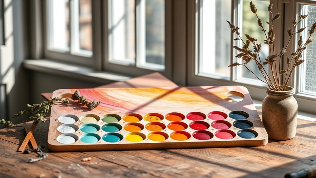
Understanding Color Theory and Harmonies
Understanding color theory and harmonies is essential for creating visually appealing color palettes. The color wheel is your primary tool, helping you visualize how colors relate to each other. By understanding harmonious combinations, you can craft balanced palettes that catch the eye. Complementary colors, positioned opposite each other on the wheel, create vibrant contrast when paired effectively. Using these color relationships ensures your palette has depth and visual interest without clashing. Recognizing how colors interact on the wheel allows you to make deliberate choices, whether you want harmony or contrast. Mastering these concepts helps you avoid mismatched colors and guides you toward palettes that feel cohesive and engaging. Additionally, understanding color interactions enables you to predict how different shades will look when combined, leading to more intentional and appealing designs. With this foundation, you can confidently select colors that work together beautifully.
Choosing a Dominant Color and Accents

Selecting a dominant color sets the tone for your entire palette and guides the viewer’s focus. Think about color psychology—how different hues evoke emotions—and choose one that aligns with your message or mood. For example, blue can promote calm and trust, while red energizes and excites. Cultural influences also play a role; colors may have specific meanings in different societies, so consider your audience’s background. Once you pick your main color, add accents that complement or contrast it to create visual interest. These accents should enhance your overall theme without overpowering the dominant hue. Additionally, understanding drivetrain components can help you appreciate how colors might be used to highlight different parts or features of a design. By carefully selecting your main color and supporting accents, you ensure your palette feels intentional, balanced, and evocative.
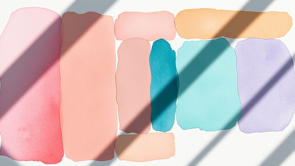
Using Color Schemes to Create Cohesion
To create a unified look in your design, using cohesive color schemes is essential. You can achieve this by understanding color psychology, which reveals how colors evoke emotions and influence perceptions. For example, blues often convey calmness, while reds evoke energy. Incorporate these insights to align your colors with your message’s intent. Cultural influences also shape how colors are perceived; what symbolizes celebration in one culture might signify mourning in another. By selecting a color scheme that considers both psychological effects and cultural meanings, you create harmony across your design. Stick to a consistent palette—such as analogous or monochromatic schemes—to guarantee your colors flow naturally and reinforce your overall aesthetic. This approach helps your design feel intentional, balanced, and visually appealing. Using consistent color schemes also supports website performance metrics by creating a smooth visual experience that encourages visitors to stay longer.
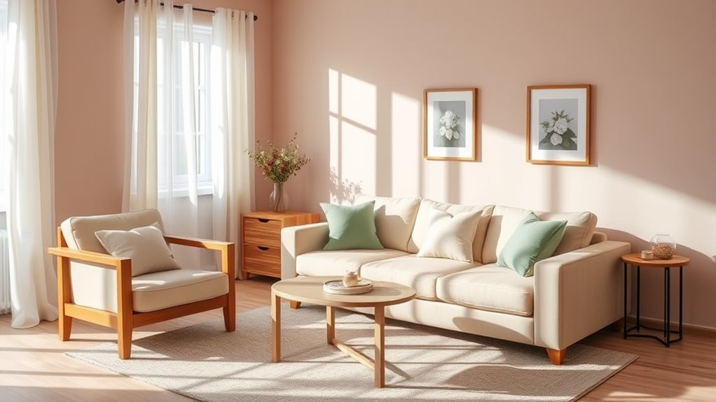
Considering Context and Environment for Color Choices

When choosing colors for your design, considering the context and environment is vital because colors can look different depending on where and how they’re viewed. Cultural influences shape how colors are perceived; what’s vibrant in one culture might be taboo in another. Additionally, aiming for environmental harmony guarantees your palette complements its surroundings. For example, earthy tones blend well in natural settings, while bold hues stand out in urban environments. Use the table below to help evaluate your choices:
| Environment | Cultural Influence | Suggested Colors |
|---|---|---|
| Natural landscapes | Local traditions | Greens, browns |
| Urban settings | Modern trends | Brights, neons |
| Cultural sites | Historical significance | Muted, classic tones |
| Workspaces | Professional expectations | Blues, grays |
This approach guarantees your palette respects context and enhances environmental harmony. Recognizing the importance of color psychology can further refine your selection process by understanding how different hues evoke specific emotions and responses.
Testing and Refining Your Palette for Perfect Flow

Testing and refining your palette guarantees that your chosen colors work together seamlessly and create the desired visual impact. Start by evaluating how your colors evoke emotions through color psychology, ensuring they align with your message. Consider cultural color meanings, as different backgrounds may interpret colors differently—what’s positive in one culture might be negative in another. Experiment with variations in hue, saturation, and brightness to achieve harmony and flow. Seek feedback from others to identify any unintended associations or clashes. Adjust colors as needed, testing how they appear across different devices or lighting conditions. This iterative process helps you refine your palette, ensuring it resonates universally while maintaining the emotional and cultural relevance you intend. Additionally, understanding support hours and accessibility can help you gather timely feedback and make adjustments more efficiently.
Frequently Asked Questions
How Can I Incorporate Trending Colors Into a Timeless Palette?
When you want to incorporate trending colors into a timeless palette, focus on maintaining color harmony and understanding color psychology. Start by selecting a neutral base and add trending hues as accents. This way, the modern colors complement the classic foundation, creating a balanced look. You’ll guarantee your space feels fresh yet enduring, as the trending shades enhance the overall vibe without overwhelming the timeless appeal.
What Tools Are Best for Visualizing Color Flow Before Committing?
Thinking about tools that help you visualize color flow is like having a crystal ball for your design. You can use digital apps like Adobe Color, Coolors, or Canva’s Color Palette Generator to explore color harmony and see how different shades work together. These tools offer instant palette inspiration, so you can experiment with combinations and guarantee your colors flow seamlessly before you commit.
How Do Lighting Conditions Affect Color Perception in a Space?
Lighting conditions profoundly influence how you perceive colors in a space. Natural light varies throughout the day, making colors appear differently in the morning versus afternoon. Artificial illumination, like warm or cool bulbs, can alter the mood and tone of your colors. You need to take into account both natural light and artificial illumination when choosing and coordinating colors, ensuring they look great under all lighting conditions for a balanced, harmonious space.
Can I Use Different Textures to Enhance My Color Palette?
You can definitely use different textures to enhance your color palette. Texture contrast adds visual interest and depth, making your space more dynamic. Mixing materials like smooth fabrics with rougher surfaces creates a tactile experience that complements your colors. By thoughtfully combining various textures, you emphasize your color choices and create a harmonious, engaging environment. Don’t be afraid to experiment with material mixing to achieve the perfect balance and style you want.
What Are Common Mistakes to Avoid When Combining Multiple Colors?
When combining multiple colors, avoid clashing hues that create visual tension and make your design hard to look at. Steer clear of overusing bold colors, which can overwhelm the eye and dilute your overall aesthetic. Balance is key—use a mix of muted tones and pops of vibrancy. Also, don’t forget to contemplate how colors interact to create harmony, helping your palette flow seamlessly and look polished.
Conclusion
Just like Da Vinci’s masterful compositions, your color palette should tell a seamless story. Embrace the dance of hues, balancing harmony with contrast, and consider the environment like an artist contemplating their canvas. Trust your intuition, test your choices, and refine until your palette flows as naturally as a river—an eternal current of beauty and unity. Remember, the perfect palette isn’t just seen; it’s felt, echoing the timeless harmony of nature itself.