
Start by examining your inspiration piece closely, noting its dominant colors, textures, and mood. Use tools like color wheels or digital analyzers to identify key hues and subtle nuances such as shadows and highlights. Craft a cohesive palette that reflects the story or emotion behind the piece, balancing harmony and contrast. Experiment with these colors in real applications, fine-tuning as you go, to create a personal, versatile collection rooted in your original inspiration. Keep exploring to unleash even more creative potential.
Key Takeaways
- Start with the main inspiration piece to identify dominant colors, textures, and mood.
- Use tools like color wheels or digital analyzers to dissect and capture subtle color nuances.
- Develop a cohesive palette by aligning colors with a specific story or emotional tone.
- Test the palette in real-world applications, adjusting based on lighting and surface interactions.
- Refine and personalize the palette to reflect the inspiration’s personality, ensuring versatility for various projects.
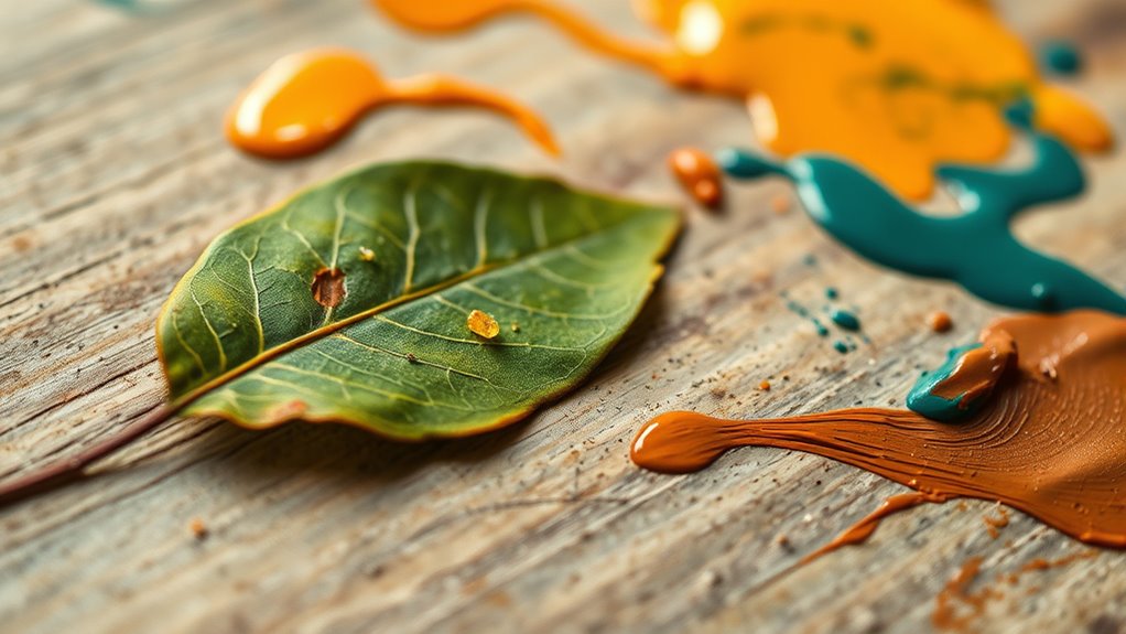
When you find that one perfect piece—whether it’s a vibrant fabric, a striking painting, or a mesmerizing photograph—it becomes the seed for your entire color palette. Its hues, textures, and mood spark a creative fire within you, inviting exploration and experimentation. You hold it in your mind’s eye, and suddenly, every shade, every tone seems to whisper possibilities. This piece isn’t just a visual anchor; it’s an emotional catalyst that guides your artistic journey. You notice how the colors flow, contrast, and complement each other, and you start to see a world beyond the initial inspiration.
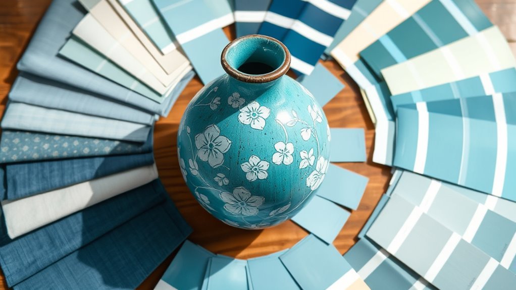
From there, you begin to dissect the piece’s colors with an attentive eye. You might grab a color wheel or digital tool to analyze the dominant hues—perhaps a warm terracotta, a soft blush, or a deep navy. But don’t just stick to the obvious; look for subtle nuances—the way a shadow darkens a tone or how a highlight adds a shimmer. These tiny variations can expand your palette, adding depth and complexity. It’s about capturing the essence of your inspiration, not just its surface. You may find that the vibrant reds inspire fiery accents, while the muted greens could translate into calming, earthy tones. Your goal is to create a cohesive collection of colors that echo the mood and personality of the original piece.
Dissect your inspiration’s colors for subtle nuances that deepen your palette and capture its true essence.
Next, think about the story you want your palette to tell. Is it lively and energetic, or serene and contemplative? The colors you choose should reflect that narrative. If your inspiration piece radiates warmth and passion, lean into fiery oranges, rich reds, and golden yellows. If it’s tranquil and introspective, soft blues, muted grays, and gentle pastels might be better suited. As you select your shades, consider their relationships—how they interact, balance, and contrast. You want harmony, but also some tension to keep things interesting. This deliberate curation transforms your initial inspiration from a single piece into a versatile, layered palette. Developing an understanding of spiritual decor elements can also help infuse your palette with deeper symbolism and positive energy.
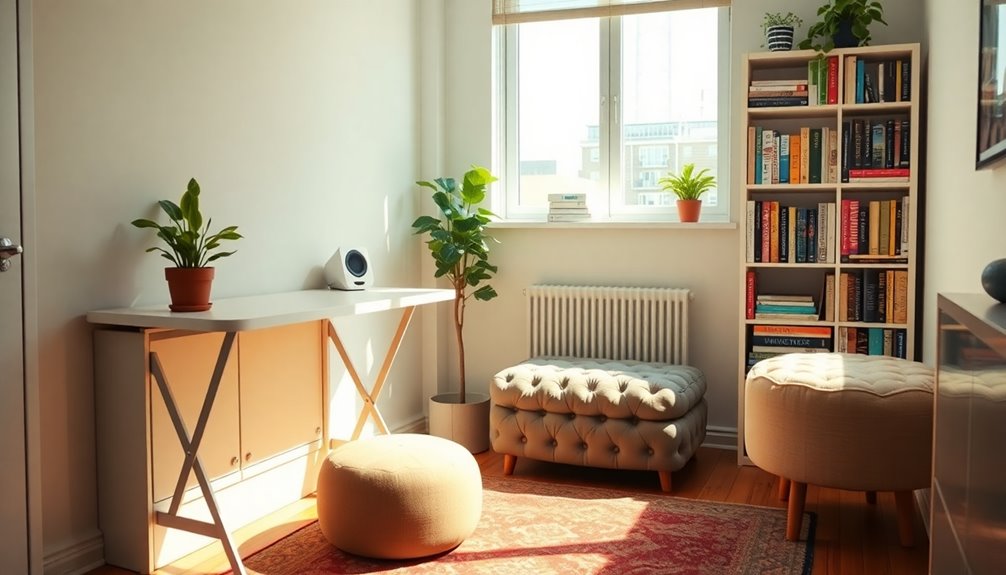
Finally, test your palette in real-world applications. Whether you’re designing a room, creating a painting, or styling an outfit, apply your chosen colors. See how they behave under different lighting conditions or against various surfaces. Adjust as needed—sometimes a color that looks perfect on screen might need to be tweaked when you see it in person. The process is iterative, a dance between your vision and reality. With patience and keen observation, your palette will evolve into a personal, expressive collection—an extension of your inspiration piece, alive with your unique interpretation.
Top picks for "build palette inspiration"
Open Amazon search results for this keyword.
As an affiliate, we earn on qualifying purchases.
Frequently Asked Questions
Can I Create a Palette From a Non-Visual Inspiration?
Yes, you can create a palette from non-visual inspiration. Imagine capturing the essence of a scent, a song, or a memory, then translating those feelings into colors. Focus on the emotions and atmosphere it evokes, choosing hues that mirror the mood. Let your intuition guide you, blending shades that resonate deeply, transforming intangible inspiration into a harmonious, visually stunning palette that tells a story beyond the visual.
How Many Colors Should a Palette Include?
You should aim for a palette of 5 to 7 colors, striking a balance between diversity and harmony. This range offers enough variety to evoke depth and richness without overwhelming the senses. Focus on selecting a dominant hue, complemented by supporting shades and subtle accents. Let each color speak to your inspiration, creating a cohesive visual story that’s both vibrant and nuanced, inviting viewers into your creative world.
What Tools Are Best for Extracting Colors?
You should try tools like Adobe Color, Coolors, or Canva’s Color Palette Generator for extracting colors. Did you know that a well-chosen palette can make your design 60% more appealing? These tools analyze your inspiration piece, pulling vibrant, subtle, or contrasting hues effortlessly. They allow you to tweak shades and save your favorites, making your creative process smooth and inspiring. Immerse yourself and let your inspiration come alive!
How Do I Ensure Color Harmony in My Palette?
To make certain of color harmony, start by choosing a dominant hue that resonates with your mood. Use analogous or complementary colors to create balance and visual interest, making sure they don’t clash. Experiment with variations in saturation and brightness to add depth. Trust your eye—step back and view your palette as a whole, adjusting until everything feels cohesive and aesthetically pleasing. Remember, subtlety often enhances harmony.
Can I Adapt a Palette for Different Design Projects?
Absolutely, you can adapt a palette for different projects by tweaking hues, saturation, and brightness to suit each context. Think of your palette as a living organism—flexible yet cohesive. Adjust the intensity for a bold poster or soften it for a subtle website. Keep the core colors consistent to maintain harmony, but don’t hesitate to introduce new shades or tones that complement your original inspiration, creating fresh visual stories.
Conclusion
As you weave the colors from your inspiration piece into your palette, you’re painting a quiet symphony of hues that dance seamlessly together. Think of your palette as a delicate garden—each shade a bloom, vibrant and alive. Trust your eye to select and blend, turning a single image into a universe of tones. With patience and intuition, you’ll craft a masterpiece that feels like it was born from your very soul, a true reflection of your creative spirit.