
To make accent colors look intentional, focus on strategic placement that guides the eye naturally, like a bold wall art or a standout pillow. Limit the number of accent spots to avoid clutter and guarantee they coordinate with your overall palette. Use lighting to highlight these areas subtly and create a balanced visual hierarchy. When you place accents thoughtfully, your space feels curated and cohesive. If you’re curious about mastering this approach, there’s more to discover below.
Key Takeaways
- Strategically position accent colors in natural focal points, like artwork or furniture, to create a deliberate visual impact.
- Limit accent spots to one or two key areas to avoid clutter and maintain a cohesive look.
- Use lighting intentionally to highlight accent colors subtly, enhancing their prominence without overpowering.
- Choose contrasting or complementary hues that harmonize with the overall color palette for visual consistency.
- Ensure placement aligns with the room’s purpose and personal style, reflecting thoughtful design rather than randomness.
Have you ever wondered where to place an accent color to make your space truly stand out? The key lies in understanding how color theory and visual hierarchy work together to create a balanced, intentional look. When you select an accent color, it’s not just about choosing a hue you like; it’s about knowing where to put it to draw attention without overwhelming the rest of the room. Your goal is to create a focal point that feels natural, not forced. This requires a strategic approach, guiding the eye through your space smoothly and deliberately.
Start by considering the principles of color theory. Bright, saturated colors tend to draw attention, so use them sparingly and in areas where you want to create emphasis. Neutral tones serve as a backdrop, allowing your accent color to pop without competing with other elements. Think about the room’s overall palette and how the accent hue can complement or contrast with existing colors. A well-chosen accent color can enhance the mood and style of the space—vibrant reds and oranges energize, while softer blues and greens promote calm. The key is to balance these choices with your room’s purpose and your personal taste. Recognizing how visual hierarchy guides the viewer’s attention can help you make more deliberate placement choices.
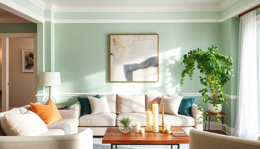
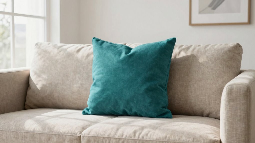
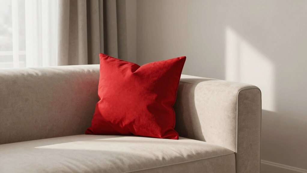
Next, focus on establishing a strong visual hierarchy. Your eye should naturally gravitate to the accent color first, then move comfortably around the room. To achieve this, place your accent in a location that’s immediately noticeable but not overwhelming. For example, a single bold throw pillow on a neutral sofa or a striking piece of artwork on a blank wall can serve as a visual anchor. Avoid clustering too many accent elements, which can dilute their impact and make the space feel cluttered or chaotic. Instead, pick one or two strategic spots for your accent color to create a cohesive, intentional look. Recognizing how visual hierarchy guides the viewer’s attention can help you make more deliberate placement choices. Additionally, understanding color interaction can assist in selecting the right hue placement that enhances the overall aesthetic without clashing.
Lighting plays an essential role in accent color placement too. Proper illumination highlights your chosen accent, making it stand out without feeling forced. Use spotlights or accent lighting to draw attention gently, emphasizing the visual hierarchy you’ve established. Keep in mind that the placement should feel effortless. If your accent color feels like it’s shouting for attention, it may be too much; if it’s barely noticeable, it might need to be more prominent. The goal is subtlety combined with purpose—your accent color should feel like a natural extension of your design, not an afterthought. Furthermore, considering color interaction with space can help you make better placement decisions and create a more cohesive look. When you align your choices with color theory and visual hierarchy, your space will feel curated and balanced, with that perfect pop of color that draws admiration without clashing or feeling forced.
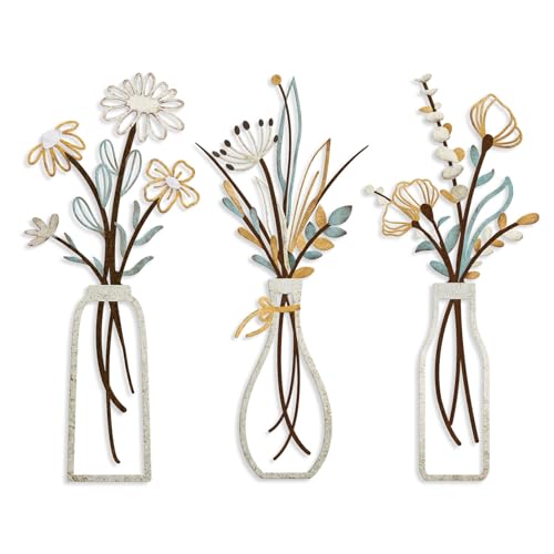
Pigort 3 Pieces Metal Flowers Wall Art- Rustic Farmhouse Decor Minimalist Decor for Living Room Bathroom Bedroom Dining Room, Housewarming Gifts Christmas Decoration(Beige, Vase-C)
- Premium Quality: Made with durable metal for lasting beauty
- Natural Themed Design: Features minimalist black flower silhouettes
- Versatile Placement: Suitable for living room, bedroom, or dining
As an affiliate, we earn on qualifying purchases.
As an affiliate, we earn on qualifying purchases.
Frequently Asked Questions
How Do I Choose the Right Accent Color for My Space?
To choose the right accent color, consider color psychology to evoke the mood you want in your space. Look at current accent color trends to stay modern and stylish. Select a hue that complements your main colors and reflects your personality. You want your accent to stand out without overwhelming, so place it thoughtfully—like in accessories or a single wall—to create a balanced, intentional look that feels natural and inviting.
Can Accent Colors Be Used in Small Rooms Effectively?
Yes, accent colors can be used effectively in small rooms. Focus on creating color balance by choosing bold or vibrant accents sparingly, so they don’t overwhelm the space. Use visual harmony by placing these accents thoughtfully—like a throw pillow or artwork—so they complement the room’s main colors. This approach makes your small space feel lively without feeling cluttered, keeping the overall look intentional and balanced.
What Are Common Mistakes to Avoid With Accent Placement?
You should avoid placing accent colors randomly, as it disrupts color harmony principles and weakens accent color psychology. Instead, focus on strategic placement—such as a bold pillow or artwork—to draw attention naturally. Stay consistent with your color scheme, and don’t overdo it; too many accents can feel chaotic. Thoughtful, intentional placement guarantees your accent color enhances the space without feeling forced, making your design look cohesive and stylish.
How Many Accent Colors Should I Incorporate in One Room?
You should incorporate one or two accent colors in a room to keep it balanced and visually cohesive. Rely on color psychology to choose hues that evoke the desired mood, like calming blues or energizing reds. Make sure your accent colors coordinate with your furniture to create harmony, avoiding overwhelming the space. Limiting your accents to a couple of shades helps make the placement look intentional and stylish, not cluttered or forced.
Does Accent Color Placement Vary With Different Design Styles?
You’re right to think that accent color placement varies with design styles. Different styles, like modern or boho, draw on color psychology and cultural influences to guide where you add pops of color. For example, bold accents may suit eclectic spaces, while subtle touches fit minimalist designs. Think of it as a dance—each style has its rhythm, and the placement of accents should feel natural, not forced, to keep the vibe cohesive and intentional.
Conclusion
By paying attention to accent color placement, you create a space that feels balanced, intentional, and inviting. You avoid chaos, emphasize harmony, and highlight key features. You control the flow, guide the eye, and set the mood—all with thoughtful color accents. When you place your accent colors with purpose, you craft a design that feels seamless, stylish, and complete. Ultimately, intentional placement transforms a mere palette into a powerful statement of your aesthetic.