The new neutral palette favors warm, layered tones like taupes, terracottas, and olive greens, blending timeless appeal with modern sophistication. These shades create a cozy yet versatile backdrop, making your space feel inviting and balanced. They work well with natural materials and diverse decor styles, allowing easy updates and personalization. If you want to explore how these trending neutrals can transform your home, you’ll discover tips to elevate your interior style seamlessly.
Key Takeaways
- Modern neutrals emphasize warm tones like taupe, terracotta, and olive green for a contemporary, sophisticated look.
- Layered textures and subtle color shifts within neutral palettes evoke calm, comfort, and elegance.
- Incorporation of historical neutrals with modern undertones creates versatile, timeless interiors.
- Bright accents such as mustard yellow or teal energize neutral spaces and add visual interest.
- These palettes are adaptable, blending well with various styles and easy to update with accessories for a fresh look.
Why Are Neutral Colors So Popular in Interior Design Today?
Neutral colors have become a staple in modern interior design because they create a calming and versatile backdrop that easily complements various styles and accents. Their popularity stems from an understanding of color psychology, which shows that neutral shades promote relaxation and balance in a space. Additionally, cultural influences shape how you perceive these hues; many cultures favor earthy tones for their grounding qualities and connection to nature. Neutral colors also adapt well to changing trends, making them a safe choice for timeless interiors. They allow you to add personality through accessories and art without overwhelming the space. This combination of psychological benefits and cultural significance helps explain why neutral palettes remain a go-to option for creating inviting, harmonious environments. Incorporating ergonomics and workflow into your design ensures that the space supports comfort and productivity alongside aesthetic appeal. Moreover, the adaptability of neutral shades allows for seamless integration of new design elements over time, maintaining freshness without the need for complete redecorating. A further advantage is that neutral palettes can be easily incorporated with natural materials, enhancing their grounding and calming effects. When choosing neutral colors, considering lighting conditions can significantly impact how the hues appear and influence the overall atmosphere. Embracing a timeless aesthetic helps ensure your space remains stylish and functional for years to come.
How Are Today’s Neutral Palettes Different From Traditional Neutrals?
Unlike traditional neutrals that focused on muted, beige, or gray tones, today’s neutral palettes incorporate a broader range of shades, including warm earth tones, soft blushes, and even subtle greens. This shift allows for more variation in neutral undertones, creating depth and personality. The key difference lies in the increased color saturation, which adds richness without overwhelming the space. Additionally, European cloud innovation influences design trends by promoting sustainable and energy-efficient choices that complement these modern palettes. You’ll notice more nuanced shades that blend cooler and warmer hues seamlessly, enhancing the overall versatility of the palettes. The palette emphasizes neutral undertones that bring warmth or coolness, depending on your preference. Colors are more vibrant and layered, offering versatility while maintaining the calming essence of neutrals. This evolution makes modern neutrals more dynamic and adaptable to different styles and moods, reflecting a broader color spectrum that aligns with contemporary design sensibilities. Furthermore, the integration of sustainable design principles supports eco-friendly choices that enhance the aesthetic and functionality of these palettes.
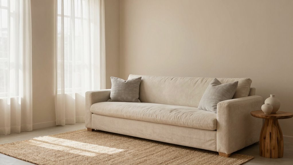
How Can You Use Soft Beiges, Taupes, and Greys in Your Home?
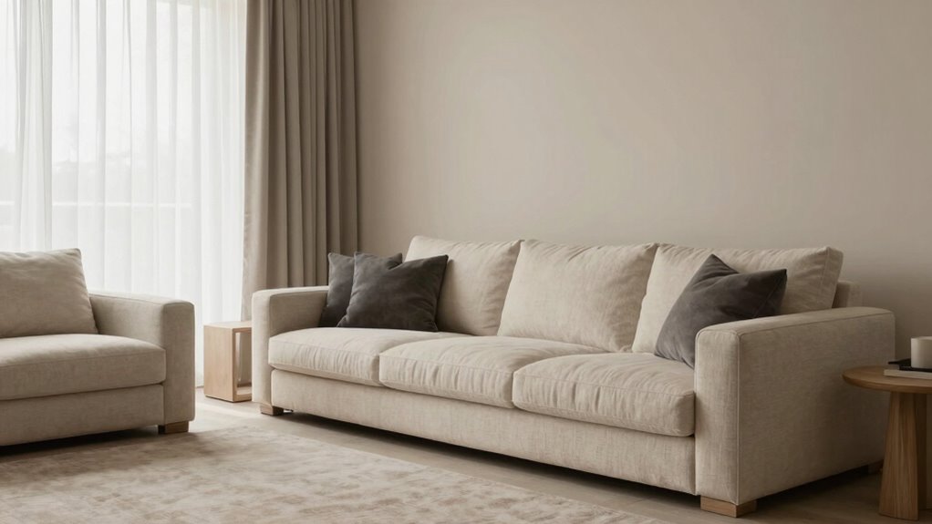
Soft beiges, taupes, and greys create a versatile backdrop for your home. You can brighten up these neutral tones with colorful accents, or keep things calming for a peaceful space. They also beautifully complement natural materials like wood and stone, adding warmth and texture. Incorporating natural materials into your decor can further enhance the soothing ambiance of these neutral shades. Additionally, choosing appropriate lighting can dramatically influence how these colors appear and feel in your space, emphasizing their calming qualities. Understanding color harmony principles can help you create balanced and visually appealing arrangements with these neutrals. Using vetted safe paints specifically designed for sensitive environments can also ensure your space remains both beautiful and healthy. Moreover, integrating lighting elements like soft, diffused fixtures can enhance the subtlety of these tones and create a more inviting atmosphere.
Pairing With Bright Accents
Bright accents can turn a subtle beige, taupe, or grey palette into a lively, inviting space. They energize your room and enhance the calming effect of neutral tones. To maximize impact, consider these strategies:
- Use bold colors like mustard yellow or vibrant teal to evoke positive emotions through color psychology, creating a dynamic contrast.
- Incorporate seasonal palettes by adding warm reds in winter or fresh greens in summer, aligning with natural seasonal moods.
- Balance brightness with soft neutrals to prevent overwhelming the senses, ensuring a harmonious atmosphere.
Pairing bright accents thoughtfully with your neutral base can refresh your space and reflect your personality, all while maintaining a sophisticated, versatile aesthetic.
Creating Calm Spaces
How can you create a calming atmosphere in your home? By using soft beiges, taupes, and greys, you tap into effective color psychology that promotes relaxation and tranquility. These neutral tones foster spatial harmony, making rooms feel balanced and cohesive. When you choose muted shades, you reduce visual clutter, allowing your mind to settle and feel at ease. Incorporate these colors through walls, furniture, or textiles to craft a serene environment. Keep the palette simple and consistent to enhance the calming effect and maintain a sense of order. This approach helps transform your space into a peaceful retreat, where you can unwind and recharge effortlessly. Soft neutrals are the perfect foundation for creating calm spaces that nurture well-being. Utilizing color psychology can further optimize the tranquil atmosphere you aim to achieve. Additionally, selecting appropriate lighting can enhance the soothing ambiance created by these neutral tones.
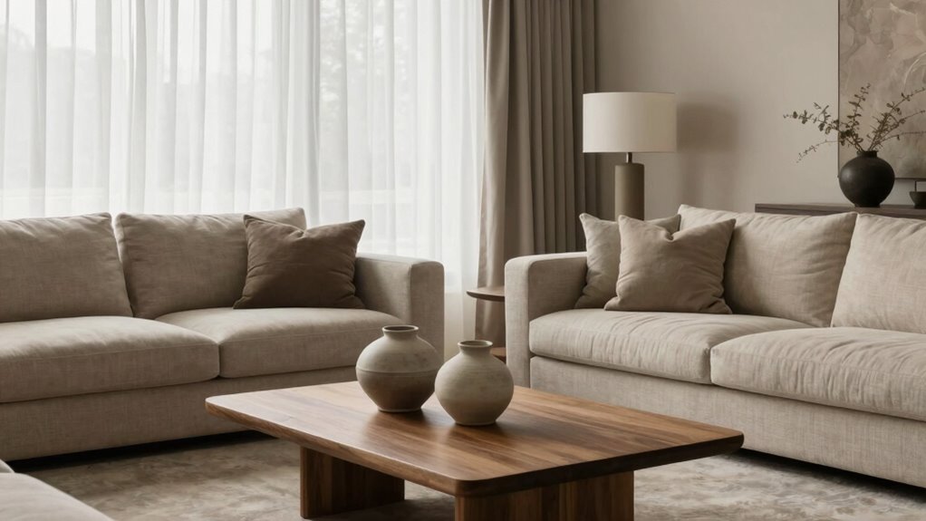
Complementing Natural Materials
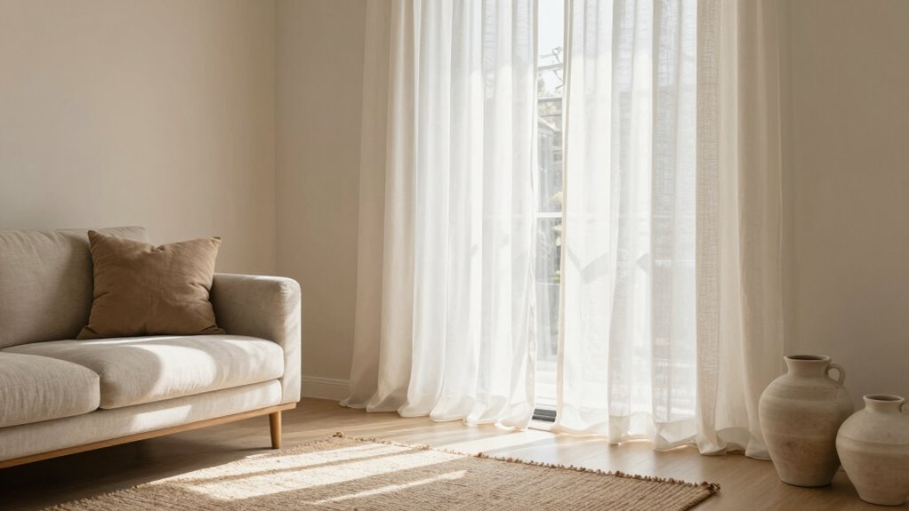
Neutral tones like beiges, taupes, and greys serve as the perfect backdrop for highlighting natural materials in your home. They create a calm, cohesive environment that emphasizes texture and authenticity. To enhance this effect, consider these approaches:
- Incorporate textural contrasts by mixing smooth surfaces with rougher, natural finishes like reclaimed wood or stone.
- Use soft beige or taupe walls to highlight natural finishes on furniture, such as linen upholstery or matte wood cabinetry.
- Add layered textiles—like woven rugs or linen curtains—in muted greys and beiges to deepen visual interest without overpowering the simplicity.
These strategies help your natural materials stand out while maintaining a harmonious, sophisticated aesthetic.
What Are the Benefits of Choosing Neutral Tones for Your Space?

Choosing neutral tones for your space offers a versatile foundation that can easily adapt to various styles and moods. These shades foster a calming environment, promoting relaxation and focus. From a color psychology perspective, neutrals evoke feelings of stability and balance, making your space feel welcoming and harmonious. Neutral hues also enhance mood by reducing visual clutter, allowing you to breathe easier and feel more at ease. They serve as a perfect backdrop for adding textures, artwork, or colorful accents without overwhelming the senses. Additionally, neutral tones are timeless, ensuring your space remains stylish and relevant regardless of changing trends. Overall, selecting neutral colors simplifies decorating, boosts mood, and creates a peaceful atmosphere you’ll enjoy every day.
How to Pick the Right Neutral Paints and Finishes for Your Home

Selecting the right neutral paints and finishes involves considering the atmosphere you want to create and how the space will be used. Your choice impacts color psychology, influencing mood and perception. To get it right, focus on these factors:
Choosing the right neutrals sets the mood and enhances your space’s harmony.
- Color undertones: Choose neutrals with subtle undertones that complement your furniture and lighting, creating harmony. Considering the sound healing science behind color perception can help you select shades that promote relaxation or energize the space. Being aware of color accuracy ensures the hues you choose remain true to your vision under different lighting conditions.
- Finish selection: Matte finishes soften spaces, while satin or eggshell adds subtle sheen, affecting light reflection and texture.
- Application techniques: Proper paint application ensures even coverage and depth, highlighting the paint’s true hue and enhancing the room’s ambiance. Additionally, understanding wall surface preparation can significantly improve the durability and appearance of your finish.
Styling Tips: Elevate Your Neutral Interior With Textures and Accessories

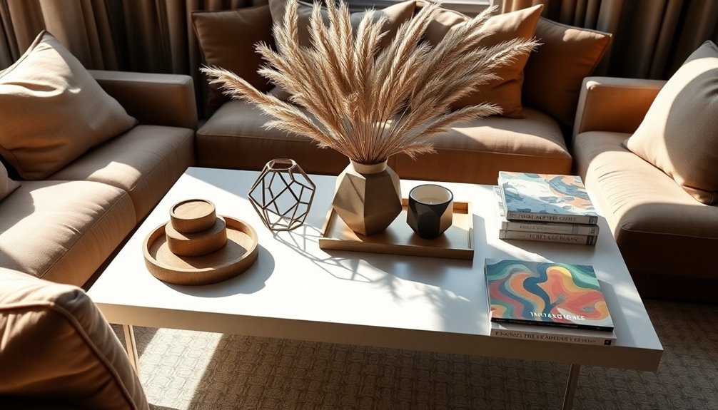
Adding textures and accessories transforms a neutral interior from plain to inviting. Use textural layering by combining different materials like woven rugs, soft throws, and matte ceramics to create depth. Incorporate accessory accents such as decorative vases, artwork, or metallic fixtures to add subtle contrast and visual interest. Mix smooth surfaces with rougher textures to keep the space dynamic without overwhelming it. Focus on balancing elements so that each piece complements the overall neutral palette. Layering textures enhances the tactile experience, making your space feel cozy and curated. Accessories should highlight the room’s tone without overpowering it. Keep your choices simple yet deliberate, allowing the textures and accents to work together seamlessly to elevate your neutral interior.
Common Mistakes to Avoid When Decorating With Neutral Colors
While neutrals create a calm and cohesive look, it’s easy to fall into common pitfalls that can make your space feel dull or uninviting. To avoid this, steer clear of these mistakes:
- Overusing neutral tones without contrast can result in a monotonous environment. Incorporate a bold accent wall to add depth and focus.
- Relying solely on neutral furniture can make your space feel flat; introduce vibrant accessories like cushions or artwork for visual interest.
- Neglecting texture variations can make neutrals seem boring—layer different materials like linen, wood, or metal to bring warmth and dimension.
- Be mindful of piercing care and hygiene to maintain a safe and healthy environment, especially if you have body jewelry that requires regular cleaning and attention.
Adding astrological insights can also inspire subtle accents or color choices that reflect personal traits and enhance the overall aesthetic.
Incorporating visual interest through contrasting elements and varied materials helps maintain visual interest and prevents your neutral space from feeling stagnant.
Furthermore, understanding the importance of attention to detail in decorating can significantly elevate the overall aesthetic and harmony of your space.
Avoid these errors to keep your neutral palette lively, inviting, and stylish without sacrificing serenity.
What Are the Latest Trends and Variations in Neutral Colors for Modern Homes?
Recent trends in neutral colors for modern homes emphasize warmth and sophistication, moving beyond traditional beige and gray tones. Today’s palette draws on color psychology, favoring hues that evoke calm, comfort, and elegance. Warm taupes, soft terracottas, and muted olive greens are becoming popular, creating inviting spaces. These variations often incorporate historical neutrals—timeless shades rooted in classic design—reinterpreted with contemporary undertones. This blend provides versatility and depth, allowing you to craft a stylish yet approachable environment. The latest trends focus on layering textures and subtle color shifts within neutral families, adding visual interest without overwhelming. As a result, your home feels both modern and rooted in tradition, balancing innovation with a sense of familiarity that suits any aesthetic.
How Do Neutral Colors Make Your Home More Flexible for Future Redecorating?

Neutral colors create a versatile backdrop that pairs easily with various accent hues and textures. They also adapt seamlessly to different decor styles, from minimalist to rustic. Plus, updating your space becomes simpler when you can change accessories and accents without overhauling the entire palette. Incorporating reconditioning techniques can ensure your furniture and fixtures stay in top condition, making your decor more sustainable and cost-effective over time.
Versatile Color Pairings
Neutral colors serve as the perfect backdrop for a wide range of furniture and accent choices, making it easy to change your decor without remodeling. They enable you to experiment with different color pairings, enhancing the room’s versatility. For example:
- Color psychology influences how you feel in a space—soft neutrals promote calm, while bold accents energize.
- Cultural influences can guide your pairing choices, blending traditional and modern elements seamlessly.
- Neutral tones allow you to incorporate diverse textures and patterns, adding depth without overwhelming the senses.
This flexibility guarantees your home can evolve with your style and preferences, whether you’re shifting to vibrant accents or subdued hues. Neutral palettes make future redecorating straightforward, offering a harmonious canvas for your creative expression.
Adaptable Decor Styles
Because they provide a calm and unobtrusive backdrop, neutral colors make it easier to switch up your home’s decor without a complete overhaul. You can experiment with layered textures—like plush rugs, woven throws, or matte finishes—to add depth and interest. Neutral tones create a flexible foundation, allowing you to introduce bold accessories such as vibrant art, statement pillows, or eye-catching lighting without clashing. This versatility means your decor can evolve effortlessly over time, from minimalist to eclectic or modern to cozy, with minimal effort. By sticking to a neutral palette, you’re better positioned to refresh your space regularly, simply by swapping out accents or updating textures. It’s a smart way to keep your decor fresh while maintaining a cohesive, stylish look.
Easy to Update
Ever wonder how your home can stay fresh and stylish without constant overhaul? Neutral colors make it easy to update your space because they’re versatile and timeless. First, they enhance paint durability, allowing you to refresh walls without worrying about color fading or chipping. Second, neutral tones are highly compatible with a wide range of furniture styles and colors, making redecorating seamless. Third, they serve as a flexible backdrop, so you can swap out accessories or accent pieces without clashing. This adaptability means you don’t need to repaint or buy new furniture every time you want a fresh look. By choosing a neutral palette, you create a foundation that’s easy to tweak, keeping your home current and inviting with minimal effort.
Frequently Asked Questions
Can Neutral Colors Be Vibrant or Are They Always Muted?
Neutral colors can definitely be vibrant rather than muted tones. You can find vibrant neutrals like bold beiges, lively grays, and rich taupes that add energy to your space or wardrobe. These shades aren’t dull; instead, they offer depth and sophistication while still feeling lively. So, if you want a neutral palette with a pop of vibrancy, look for shades that combine subtle hue variations and rich undertones for a striking effect.
How Do Neutral Palettes Affect Room Lighting and Mood?
Did you know that rooms with neutral palettes can boost natural light reflection by up to 20%? Neutral colors help create a bright, airy feel that enhances your room’s natural light, making it appear larger and more inviting. They also promote calmness and relaxation, positively affecting your mood. By choosing the right neutrals, you can effortlessly shape your space’s mood and maximize natural light for a cozy, uplifting atmosphere.
Are Neutral Colors Suitable for Small or Large Spaces?
Neutral colors work well in both small and large spaces, depending on your goals. In small rooms, they create a sense of openness and calm, making the space feel bigger. For large rooms, neutrals add warmth and sophistication. When decorating with neutrals, understand color psychology to choose shades that evoke the desired mood. Ultimately, neutrals can enhance any space, making it versatile and timeless while allowing your accessories to stand out.
What Accessories Work Best With Neutral Interior Designs?
You should choose decorative accents and wall art that add pops of color or interesting textures to your neutral interior. Think vibrant throw pillows, bold vases, or striking wall art to create visual interest. Metallic finishes or natural materials like wood and stone work well too. These accessories enhance your space without overwhelming the neutral palette, making it feel balanced and inviting. Keep it simple yet expressive with well-chosen decorative accents.
How Do I Incorporate Trendier Shades Into a Neutral Scheme?
You can elevate your neutral scheme effortlessly by adding bold accent walls in trending shades like deep emerald or vibrant terracotta. Incorporate textured fabrics such as plush cushions or woven throws to bring depth and interest. These small, striking touches create a dynamic look that’s both modern and timeless, making your space feel like a masterpiece. Don’t shy away from mixing hues—your neutral base is the perfect canvas for trendy pops of color!
Conclusion
Embracing neutral colors is like planting a versatile garden—ready to bloom with your style. These hues provide a calm canvas, inviting you to add bursts of color or keep it serene. With their timeless charm, your home becomes a cozy sanctuary, easily adapting as your tastes evolve. So, let your space breathe, grow, and transform—neutral tones are the gentle foundation for your ever-changing personal masterpiece.