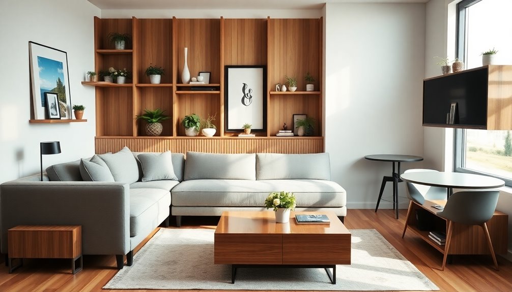

To use repetition without looking matchy, focus on creating harmony through subtle variations in scale, color, or texture. Incorporate consistent visual cues like colors or typography, but introduce slight differences in size, placement, or style to keep things interesting. Balancing predictability with surprises helps you maintain flow while avoiding monotony. Fine-tuning these techniques allows your design to feel cohesive yet dynamic—if you keep exploring, you’ll discover how to achieve this balance effortlessly.
Key Takeaways
- Vary the size, shape, or style of repeated elements to create visual interest and prevent sameness.
- Incorporate subtle color shifts or textures within repeated patterns for cohesion with a touch of contrast.
- Use consistent visual cues like typography or color but introduce slight differences to add depth.
- Balance repetition with contrasting elements to highlight key areas without overwhelming the design.
- Introduce unexpected variations or asymmetrical placements to break monotony while maintaining harmony.
How Repetition Creates Harmony in Design
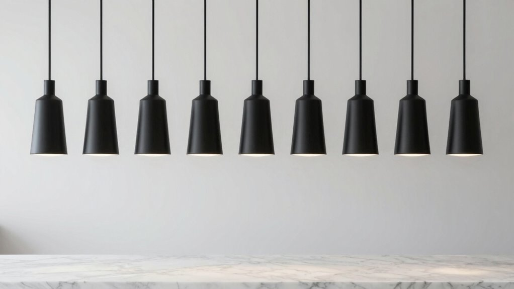
Have you ever noticed how repeating elements in a design can instantly create a sense of unity? That’s the power of rhythm and unity. When you use consistent patterns, shapes, or colors, your design feels cohesive and harmonious. Repetition establishes a visual rhythm that guides the eye smoothly across the layout. But it’s important to balance consistency with variation—too much sameness can become dull, while too much difference can break the harmony. By carefully adjusting how often and where you repeat elements, you reinforce the overall message without making the design look monotonous. This subtle play between repetition and variation helps keep your design engaging, while still maintaining a unified look that feels intentional and polished. Understanding Free Floating concepts can further enhance how repetition is used to create seamless and dynamic visual experiences.
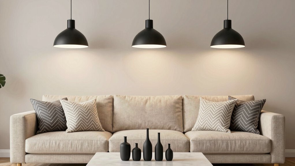
Adding Variety to Repetition for Visual Interest
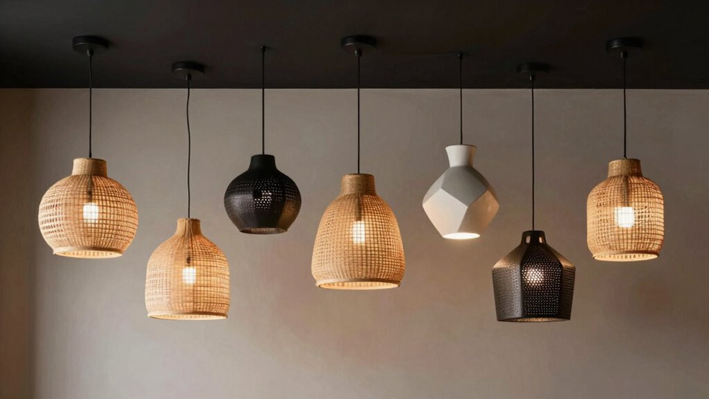
While repetition helps create harmony, adding subtle variations keeps your design lively and interesting. You can attain this by playing with variations in scale, making some elements slightly larger or smaller than others. This variation prevents the design from feeling monotonous and adds depth. Incorporating unexpected repetitions, like repeating a pattern or shape in an unforeseen way, also creates visual surprises that engage viewers. These small adjustments make your repeated elements feel intentional and dynamic rather than predictable. Remember, the key is to keep the variations subtle enough to maintain cohesion while still providing enough contrast to catch the eye. This balance ensures your design remains unified yet vibrant, avoiding the pitfall of looking too matchy. Additionally, considering visual hierarchy can guide viewers’ attention and improve overall clarity. Exploring European cloud innovation into your design approach can also inspire fresh, modern ideas that align with sustainable practices. Incorporating sustainable design principles and exploring innovative bike conversion kits can further enhance your understanding of how repetition and variation influence product design and user experience.
Using Color, Pattern, and Texture to Keep Designs Fresh
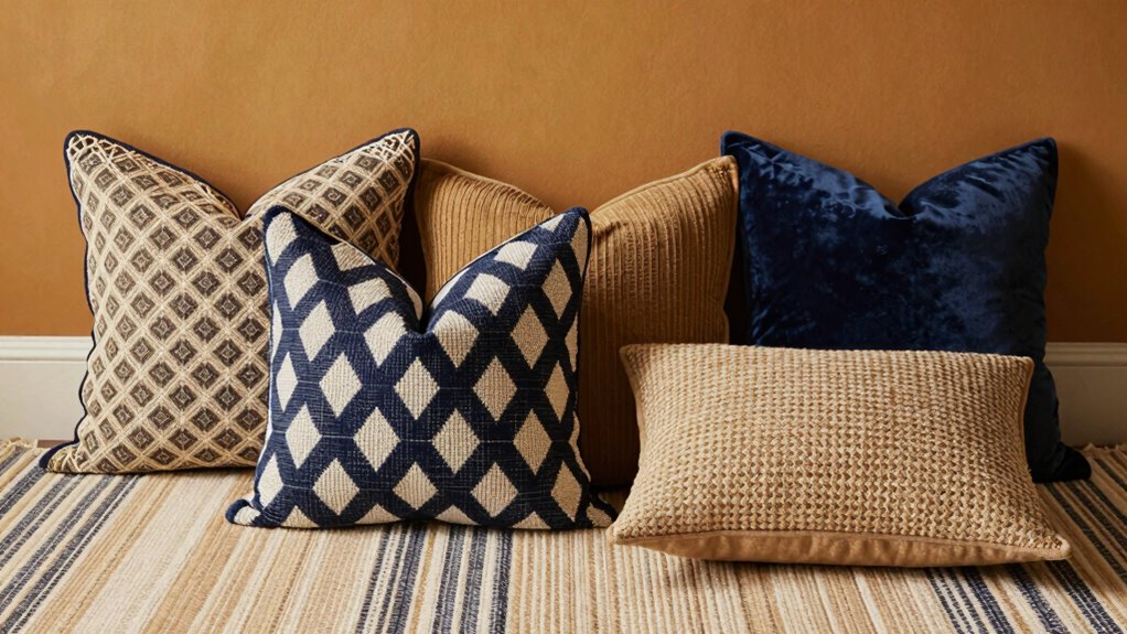
Ever wonder how to keep your designs visually engaging? The key is mastering the use of color, pattern, and texture. Achieve color harmony by selecting complementary or analogous hues that create cohesion without blending together. Incorporate varied patterns to add visual interest, but keep them balanced so they don’t overwhelm. Texture layering is essential—combine smooth and rough surfaces or matte and glossy finishes to add depth and tactile appeal. These elements work together to prevent your design from feeling monotonous, even when repetition is involved. To optimize your approach, understanding auditory processing principles can inform how you balance elements to create harmony and contrast effectively. Recognizing how repetition can either enhance or detract from a design’s rhythm is crucial, especially considering visual perception factors that influence viewer engagement. Additionally, being mindful of sensory integration can help you craft more cohesive compositions. For example, integrating multiple senses through multisensory design techniques can elevate the overall aesthetic. By thoughtfully mixing colors, patterns, and textures, you create a dynamic look that stays fresh and enthralling, inviting viewers to explore and appreciate every detail without the design appearing overly matchy. Effective interior design basics ensure that repetition enhances rather than hinders your overall aesthetic.
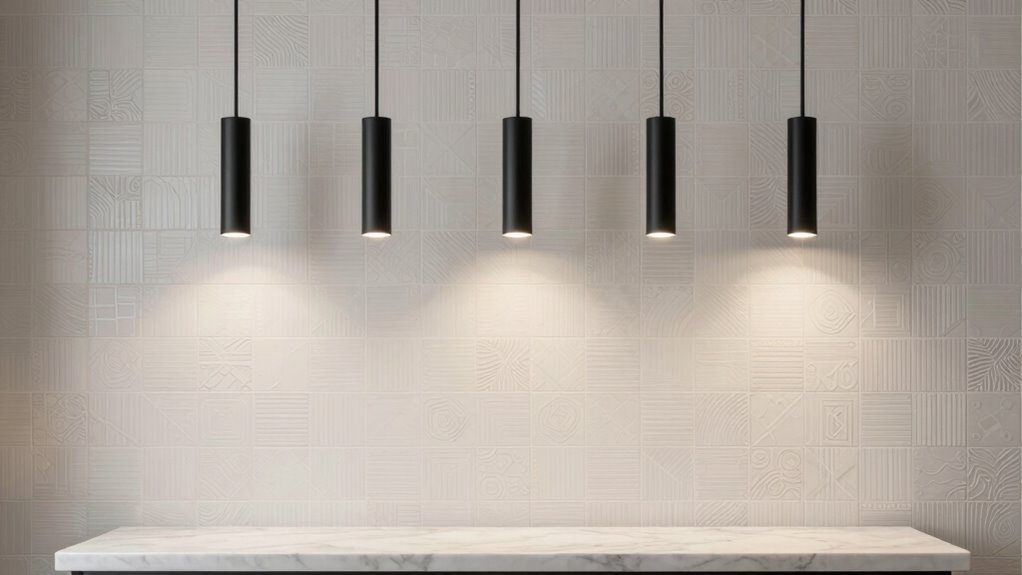
Balancing Repetition and Contrast for Dynamic Effects
Balancing repetition and contrast is what keeps your designs lively and engaging. When you create visual rhythm, pattern variation becomes key. Too much repetition can feel monotonous, while too much contrast can cause chaos. To strike harmony, vary your patterns subtly—use different sizes, shapes, or textures—so your eye moves smoothly across the design. Incorporate contrast intentionally, like pairing bold elements with subdued ones, to emphasize key areas without disrupting flow. This visual rhythm guides viewers’ attention seamlessly through your composition. Understanding fundamental design principles helps in achieving this harmony effectively. Paying attention to pattern variation ensures your work remains dynamic and visually interesting. Additionally, employing AI-powered visual analysis can assist in fine-tuning the balance between repetition and contrast for optimal impact. Recognizing how essential oils are used for different health concerns can inspire creative approaches to pattern and contrast in design.
Practical Tips to Use Repetition Without Boring Your Audience

To keep your audience engaged, incorporate repetition thoughtfully by varying its elements rather than repeating the same pattern exactly. Use consistent visual cues like color schemes, typography, or iconography to establish visual consistency, but introduce subtle variations to keep things fresh. This approach reinforces your brand identity without becoming monotonous. For example, repeat key design elements across different layouts, but tweak their size, placement, or style slightly. Incorporate rhythm through consistent spacing or recurring motifs, yet vary their execution to avoid predictability. Focus on maintaining a cohesive look while surprising your audience with clever variations. Additionally, understanding visual harmony can help you balance repetition with variation effectively. This balance ensures your message remains recognizable and memorable, preventing repetition from feeling dull or overwhelming. Being mindful of visual hierarchy can further guide how you repeat and vary elements to lead the viewer’s eye naturally. Incorporating design principles such as contrast and alignment can also enhance this balance, making your designs more dynamic and engaging. Moreover, applying consistent branding across different elements helps strengthen recognition while allowing room for creative variation that keeps your designs lively. Paying attention to visual rhythm can also create a sense of movement and flow, making your design more engaging and less static.
Frequently Asked Questions
How Can I Combine Multiple Repeated Elements Without Overwhelming the Viewer?
To combine multiple repeated elements without overwhelming your viewer, focus on color harmony and visual hierarchy. Use a consistent color palette to tie different elements together while varying sizes, shapes, or placement to create contrast. Limit the number of repeated elements and strategically space them to guide the eye. This approach guarantees your design remains cohesive yet engaging, avoiding clutter while emphasizing key areas effectively.
What Are Subtle Ways to Introduce Repetition in Minimalist Design?
You might think subtlety is hard, but it’s your secret weapon. Use slight variations in color harmony and spacing to introduce visual rhythm without shouting. Think of a whisper rather than a scream—small shifts in tone or shape create consistency that feels effortless. These tiny repetitions weave harmony into your minimalist design, making it intriguing yet calm, as if the elements are dancing in quiet, perfect sync without overpowering the whole.
How Do Cultural Differences Influence Repetition in Design?
You should consider cultural symbolism and regional aesthetics when incorporating repetition in design. Different cultures interpret symbols and patterns uniquely, influencing how repetition resonates. For example, motifs meaningful in one culture might seem repetitive or overwhelming elsewhere. By understanding these cultural nuances, you can adapt repetition techniques to honor regional aesthetics, creating designs that feel authentic and engaging without appearing matchy or overly uniform.
Can Repetition Be Used Effectively in Small-Scale or Digital Designs?
Think of your small-scale or digital design as a delicate garden—you want harmony without chaos. Repetition acts like gentle watering, reinforcing your message without overwhelming. Use subtle pattern variation and maintain color harmony to create visual rhythm. Repetition can be highly effective here, guiding the eye smoothly across the design and adding cohesiveness, even in limited space. Just remember, less is often more in tight, digital layouts.
What Tools or Software Best Assist in Applying Repetition Creatively?
You can use tools like Adobe Illustrator and Photoshop to apply repetition creatively with typography patterns and color schemes. These programs let you experiment with repeating elements, adjust colors, and create seamless patterns that don’t look matchy. Additionally, Canva and Figma offer user-friendly interfaces for exploring repetition in digital designs. With these tools, you can craft visually engaging, cohesive designs that utilize repetition without feeling overly uniform or predictable.
Conclusion
By mastering repetition, you can weave harmony into your designs like a skilled composer. Just as a song benefits from recurring melodies, your work gains cohesion and rhythm without becoming dull. Mix in variety, contrast, and texture to keep your audience engaged, turning sameness into a symphony of visual interest. Remember, repetition is your secret ingredient—use it thoughtfully, and your designs will dance gracefully without falling into the trap of looking matchy.