
When designing with negative space, you guide the viewer’s eye by carefully balancing empty and filled areas, turning silence into a compelling part of your composition. Use it to create subtle shapes, highlight focal points, and evoke emotions like calm or energy. Resisting clutter and focusing on what you exclude makes your design more elegant and memorable. Mastering this approach unleashes a world of creative possibilities—keep exploring to discover how to use negative space effectively.
Key Takeaways
- Prioritize clarity by intentionally leaving empty space to highlight key design elements.
- Use negative space to create hidden shapes or messages that add visual interest and memorability.
- Balance positive and negative space to establish harmony and guide the viewer’s eye effectively.
- Avoid clutter by focusing on what to exclude, enhancing overall elegance and understanding.
- Utilize tools and techniques that allow precise control of negative space to craft deliberate, impactful compositions.
Negative space, often overlooked as merely empty or leftover area, is actually a powerful tool that shapes how your design communicates and resonates. Think of it as the silent breath between your visual elements—a quiet space that guides the eye, emphasizes key points, and creates a sense of balance. When you master negative space, you craft designs that breathe, inviting viewers to explore without feeling overwhelmed. It’s the unseen framework that gives your focal points room to stand out, making your message clear and compelling.
Master negative space to create balanced, impactful, and memorable designs that breathe and guide the viewer effortlessly.
Imagine a logo where the empty space around a symbol forms a subtle shape—a hidden arrow, a clever letter, or an abstract figure. That space isn’t wasted; it’s integral to the message, enhancing recognition and memorability. Every curve, gap, or margin in your composition acts as a visual pause, allowing the eye to rest and process the information. This deliberate openness doesn’t diminish your design’s impact—it amplifies it, providing contrast and clarity that cluttered designs often lack. You’re not just filling space; you’re sculpting it deliberately to serve your narrative.
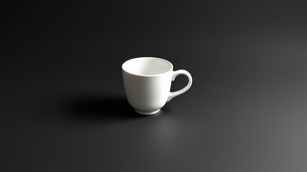
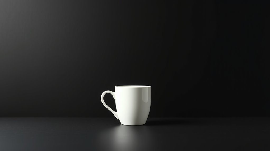
Visualize a poster with a bold image at its center, surrounded by generous negative space. The emptiness draws attention inward, making the central element pop. It’s like a spotlight—your eye is naturally pulled toward the focal point, and the surrounding emptiness creates a sense of importance and sophistication. Negative space can also evoke emotion; a sparse, open layout might feel calm or luxurious, while a more structured, filled one might seem energetic or chaotic. Your choice of negative space shapes the mood, tone, and personality of your design, influencing how viewers interpret and feel about it.
Using negative space effectively means paying close attention to what you exclude as much as what you include. You’re guiding viewers’ eyes, directing their focus, and creating an experience rather than just an image. It requires discipline—you must resist the urge to fill every gap, to clutter your canvas with unnecessary details. Instead, consider each element’s purpose and ask whether the space around it enhances or distracts. When you allow negative space to work in harmony with your positive elements, your designs gain a sense of elegance and clarity that’s impossible to achieve through busyness alone.
Additionally, incorporating proper app tools can help you precisely manage negative space and improve your overall design quality. Ultimately, negative space isn’t just empty space—it’s a strategic canvas on which your creative ideas come to life. It offers room for your audience to breathe, understand, and connect with your message. When you harness its power thoughtfully, your designs transform from cluttered visuals into compelling, memorable stories told through the art of what’s left unsaid.
Frequently Asked Questions
How Can Negative Space Improve Overall Design Balance?
Negative space sharpens your design balance by creating visual harmony, allowing key elements to breathe. When you use space thoughtfully, it guides the viewer’s eye smoothly across the composition, preventing clutter. This open area acts like a visual pause, emphasizing focal points and making your design feel polished and intentional. By balancing filled and empty spaces, you craft a scene that’s both engaging and easy to navigate, elevating your overall aesthetic.
What Are Common Mistakes to Avoid When Using Negative Space?
You might stumble into cluttered designs if you ignore the magic of balance, crowding your space and confusing the eye. Avoid overusing negative space, which can make your work feel empty or disconnected. Be cautious with alignment—disorganized elements disrupt harmony. Steer clear of inconsistent spacing that hampers flow. Instead, let your negative space breathe, guiding viewers smoothly around your design, creating clarity and visual harmony that feels both intentional and inviting.
How Does Negative Space Influence Viewer Perception?
Negative space guides your eyes, shaping how you interpret the scene. It creates a sense of balance, emphasizing focal points and making images feel more open or dynamic. When used effectively, it can evoke emotions like calmness or tension, depending on its arrangement. You’ll notice how ample negative space can make details stand out, influencing your perception by directing attention and shaping your emotional response to the design.
Can Negative Space Be Used in Digital and Print Design?
Absolutely, negative space works wonders in both digital and print design. You can craft sleek websites or eye-catching print ads by letting empty space breathe, guiding your viewer’s eye effortlessly. Think of it as painting with silence—each empty area emphasizes the main subject, creating a visual rhythm. Whether on screen or paper, negative space is your secret weapon to make designs feel balanced, sophisticated, and impactful.
What Tools or Software Best Assist in Designing With Negative Space?
You can use Adobe Illustrator and Photoshop to craft striking negative space designs. Illustrator’s precise vector tools help you carve out clean, geometric shapes, while Photoshop’s layering and masking features let you experiment with shadows and contrasts. Canva is also great for quick, creative explorations with intuitive drag-and-drop. These tools empower you to visualize and manipulate space creatively, turning empty areas into compelling visual elements that enhance your overall design.
Conclusion
Think of negative space as the silent wind that shapes a grand landscape—you don’t see it directly, but it guides your eye and defines the scene. When you master this invisible force, your design becomes a delicate dance of balance and harmony. Like a painter’s empty canvas or a sculptor’s untouched marble, negative space holds the power to turn simple shapes into enthralling stories. Embrace it, and watch your creations breathe with life and purpose.