The 60-30-10 rule guides you to balance your space with a dominant color or element, a secondary accent, and pops of bold highlights for visual harmony. However, breaking the rule can create surprises, emphasize unique features, or express personality more freely. Slight deviations allow more creativity, making your space feel fresh and personalized. For a deeper understanding of when and how to bend these guidelines, explore more about the art of intentional design choices.
Key Takeaways
- The 60-30-10 rule provides a flexible framework for balanced room design, dividing elements into dominant, secondary, and accent components.
- Breaking the rule introduces creative surprises, allowing for personalized spaces and emphasizing specific features or moods.
- Adjusting proportions can highlight a particular element or create a more dynamic, less predictable aesthetic.
- The rule encourages intentional deviations to add visual interest and prevent monotony in interior design.
- Use the 60-30-10 guideline as a starting point, but feel free to adapt it to suit your style and the unique character of your space.

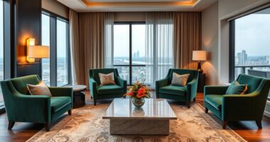
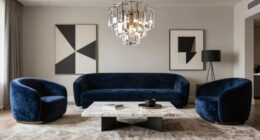
Ever wondered how you can create a balanced, visually stunning space with just three simple principles? The 60-30-10 rule offers a master key to harmony, guiding your eye and heart to a composition that feels both effortless and intentional. Imagine dividing your room into three parts: the dominant color or element takes up 60%, setting the mood and anchoring the space. This might be a wall painted in a warm, neutral tone or a large piece of furniture that commands attention. As you step back, you’ll notice how this large, grounding presence creates a sense of stability, inviting you to explore the finer details without feeling overwhelmed.
Master the 60-30-10 rule to create balanced, harmonious, and visually captivating spaces effortlessly.
Next, the 30% acts as a secondary accent—something that complements the dominant color, adding depth and visual interest. Think of plush cushions, a cozy armchair, or even a textured rug in this midway area. It’s where your personality begins to shine through, balancing boldness with subtlety. You want this part of the palette or decor to stand out just enough to guide your gaze naturally from the main feature, creating a rhythmic flow across your space. Here, contrast and variation come into play, enriching the environment without disrupting its harmony. Additionally, understanding color balance can help you fine-tune the proportions for a more harmonious design.
Finally, the 10% is reserved for accents—bright, bold colors or small decorative objects that punch up the overall aesthetic. These are your statement pieces: a vibrant piece of artwork, a quirky lamp, or metallic accessories that catch the light. This tiny slice acts like a punctuation mark, injecting energy and personality into the room. It’s where you get to experiment, where a splash of unexpected color can elevate the entire design from good to extraordinary. Used thoughtfully, these accents pull the eye, creating focal points that energize the space without overpowering it.
But here’s the secret: while the 60-30-10 rule provides a reliable framework, it’s also flexible. There are moments when breaking the rule can breathe fresh life into your design. Maybe a room feels too subdued, and you want a burst of color in the 10% to energize the atmosphere. Or perhaps you want to emphasize a particular feature by making it occupy more visual weight than the rule suggests. The beauty lies in knowing the rule’s principles so well that you can bend or break them intentionally, crafting a space that’s uniquely yours. After all, rules are just starting points—your intuition and creativity are what turn a good design into an extraordinary one.

Large Framed Boho Modern Neutral Abstract Wall Art for Living Room, 3 Piece Black and White Canvas Prints Paintings Artwork for Walls, Geometric Pictures for Office Bedroom Dining Room Decor, 24×36 In
- Set Includes Three 24×36 Inch Prints: Three-piece boho modern wall art set
- Large Framed Wall Art: Total display size 36" H x 72" W
- Black and White Geometric Design: Stylish neutral abstract artwork
As an affiliate, we earn on qualifying purchases.
As an affiliate, we earn on qualifying purchases.
Frequently Asked Questions
How Flexible Is the 60-30-10 Rule Across Different Design Styles?
You’ll find the 60-30-10 rule surprisingly flexible, adapting beautifully across diverse design styles. Whether you lean toward minimalism, where subtle color shifts create harmony, or bold maximalism, where vibrant accents stand out, this rule guides your palette with ease. Feel free to tweak the ratios—add more color for drama or scale back for serenity—knowing that its core principle remains a versatile foundation for your creative expression.
Can the Rule Be Adapted for Non-Visual Aspects Like Branding?
Absolutely, you can adapt the 60-30-10 rule for branding, like stretching a melody to fit your song. Think of it as a guiding rhythm for your brand identity—color palettes, tone, and messaging—ensuring harmony and balance. Use dominant brand colors sparingly but impactfully, with accents that highlight key values. This flexible approach keeps your brand vibrant, memorable, and emotionally resonant, much like a beautifully composed piece of art.
What Are Common Mistakes When Applying the 60-30-10 Rule?
You often mistake balancing colors by rigidly sticking to percentages, ignoring the emotional impact or harmony. Overusing the dominant hue can overwhelm, while neglecting contrast makes the palette dull. Rushing the process, you miss subtle nuances that create visual interest. Instead, experiment with variations, trust your intuition, and remember that breaking the rule can release unique, captivating designs. Flexibility fuels creativity—don’t be afraid to bend, blend, and refine.
How Does Color Psychology Influence the Rule’s Effectiveness?
Color psychology acts as the artist’s brush in your design, influencing the 60-30-10 rule’s impact. Bright reds energize, drawing attention, while cool blues calm and create balance. When you choose colors intentionally, you craft a visual symphony that guides viewers’ emotions and focus. Remember, a picture is worth a thousand words—your color choices shape perceptions, making your design resonate deeply and effectively, like a well-tuned melody.
Are There Digital or Interactive Design Contexts Where the Rule Doesn’T Apply?
In digital and interactive design, the 60-30-10 rule often bends or breaks, especially in dynamic interfaces. You might prioritize bold, contrasting colors for calls-to-action or immersive visuals that defy traditional proportions. As you craft engaging experiences, you’ll find that breaking the rule sparks creativity, guiding user focus through movement, animation, or layered color schemes. This flexibility allows your designs to breathe, adapt, and truly captivate in a digital domain.
Conclusion
So, seize the spirit of the 60-30-10 rule, but stay savvy enough to steer, shift, or shatter it when style and strategy demand. Remember, flexibility fuels your fabulous fashion, and breaking boundaries can boost brilliance. Let your unique understanding unfurl, and don’t be dictated solely by dictates. With daring decision-making and daring designs, you’ll define your distinctive style story—showcasing strength, sophistication, and a splash of spontaneous splendor. Style smarter, break boldly!